-
ASHIYA OPTICAL STORE芦屋眼鏡鋪
- Category : Retail store / 物販店
- Location : Japan / 日本
- Area : 57.78㎡ / 57.78平米
- Constructor : interior / 内装設計
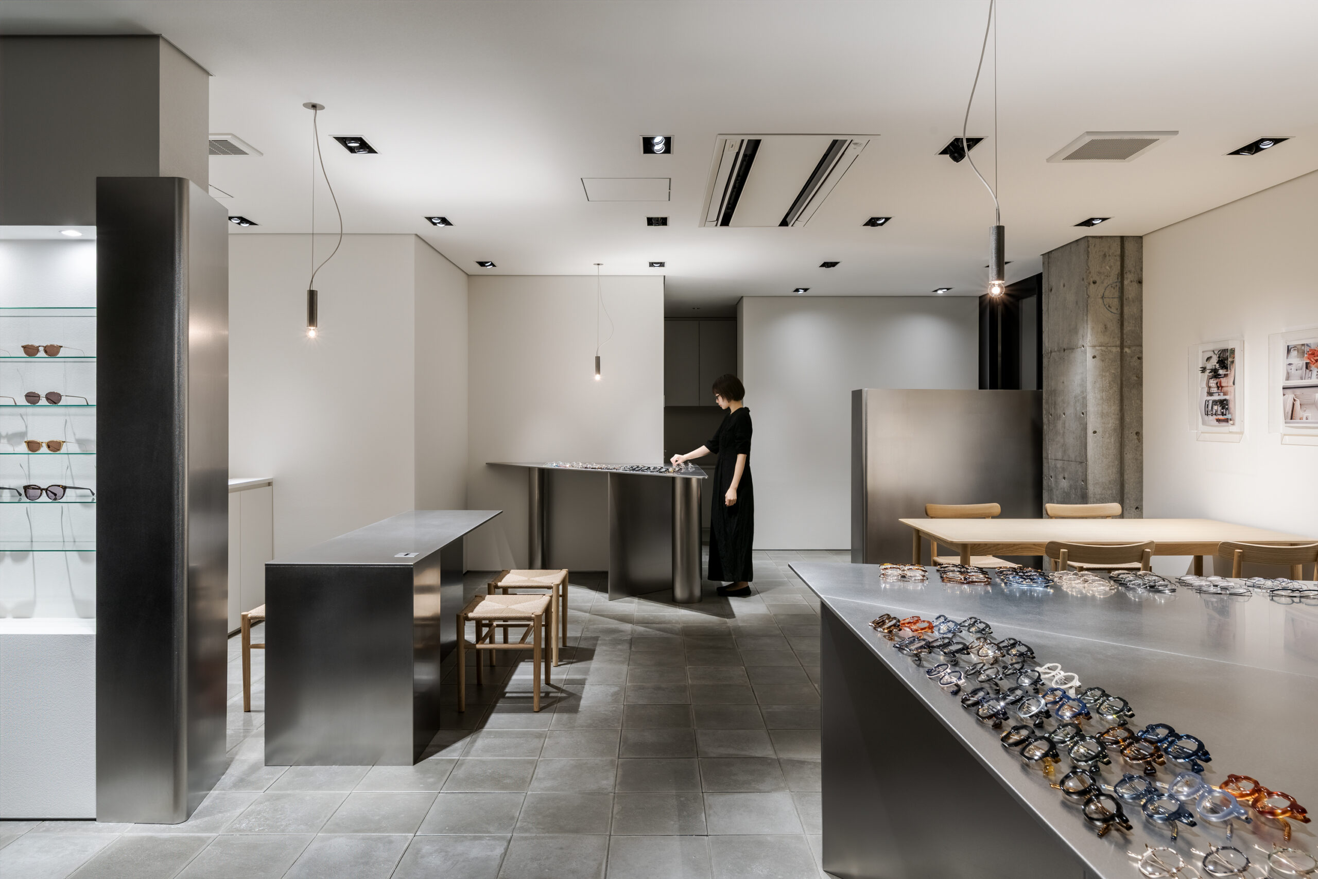
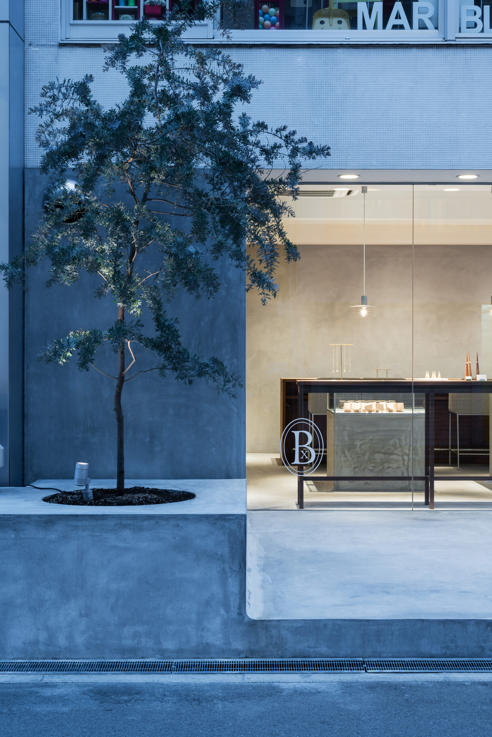
芦屋を拠点とするアイウェアストア「芦屋眼鏡舗」のインテリアデザイン。
オーナーは建築やデザインに深く興味を持ち、単に商品を販売するような従来のプランニングではなく、接客する風景や展示するアイウェアを空間の一部として捉えられるような”場”を求めていた。
ロケーションは、芦屋の閑静な街の一角。
新築で進められていたビルは、周りの道路や路線に沿って計画されたことから、多様な角度で構成された外観となり、そのアウトラインがそのまま各テナントに影響しているような区画であった。
我々はまず、従来のように建築とインテリアのデザインを隔てることなく、歩幅を合わせた空間作りができないかと考察した。
そこで、多様な角度を用いられた外壁(構造)に沿うように、オフセット(ずらし)しながら複製し、内部壁やディスプレイ家具などインテリアラインを形成していった。
建築構造と同様の角度を帯びさせることで、建築の匂いが徐々にインテリアシンボルとして機能形成されていくようなことを試みている。
また、角度を帯びたインテリア群により、接客などのコミュニケーションにおいても角度を帯びる結果へと繋がっていく。
さらには、スケルトンを生かした開放感のある天井を選択せず、あえて落ち着きのある天井の低いシーンを入手するために、梁型が隠れる天井ラインまで高さをコントロールした。
しかし、露骨なスケルトン天井の迫力ある魅力を塞ぐことは、時に空間として弱点となりうるため、300角のスクウェア形状に形取ったコンクリート平板を床に用いることで、建築が持つ力を内装に転換維持している。
オリジナルのペンダントライトも建築、家具の延長線上に位置するものとし、什器同様のマテリアルを採用した。
コンパクトな照明ではあるが、ワイヤー吊りすることでソケットとコードの関係性を柔らかなものにしている。
アイウェアが空間に溶け込むことで、丁寧にメガネと対峙できるような”場”を目指した。
-
The interior design of an Eyewear Store located in Ashiya, Hyogo, Ashiya Optical Store.
The owner had a deep interest in architecture and design, and sought a place that was not based on conventional planning focused simply on selling products, but one in which scenes of customer service and the displayed eyewear could be regarded as part of the space itself.
That location was tucked away in a quiet corner of the town of Ashiya.
The facade of the new building was articulated through multiple angles, as it was planned along the road and the railway, and its outline directly influences the tenant space.
We considered how a space could be designed with a shared rhythm, without conventionally separating architecture and interior.
Following the structure of the exterior walls, articulated through multiple angles, the geometry was duplicated with subtle offsets. Through this process, a series of interior lines were generated, forming internal walls and display furniture.
By introducing angles similar to those of the architectural structure, we attempt to allow the presence of architecture to gradually emerge and function as an interior symbol.
Customer interactions are also articulated through a series of angular interior elements.
Furthermore, rather than exposing the skeletal ceiling to emphasize openness, the ceiling height was deliberately controlled to conceal the beams, creating a calmer spatial atmosphere.
However, enclosing the raw presence of the skeletal ceiling risks weakening the space by diminishing its dynamic character.
To reinterpret and retain the architectural force, 300 × 300 mm square concrete paving slabs were introduced to the floor.
The original pendant lights were positioned along the same line as the architecture and furniture, adopting the same materials used for the display fixtures.
Although the light itself is compact, suspending it by wire softens the relationship between the socket and the cord.
By allowing the eyewear to blend seamlessly into the space, the store aims to create a place where each pair of glasses can be approached with care and attention. -
3D SNAPスリーディースナップ
- Category : Retail store / 物販店
- Location : Japan / 日本
- Area : 15.82㎡ / 15.82平米
- Constructor : Interior / 内装設計
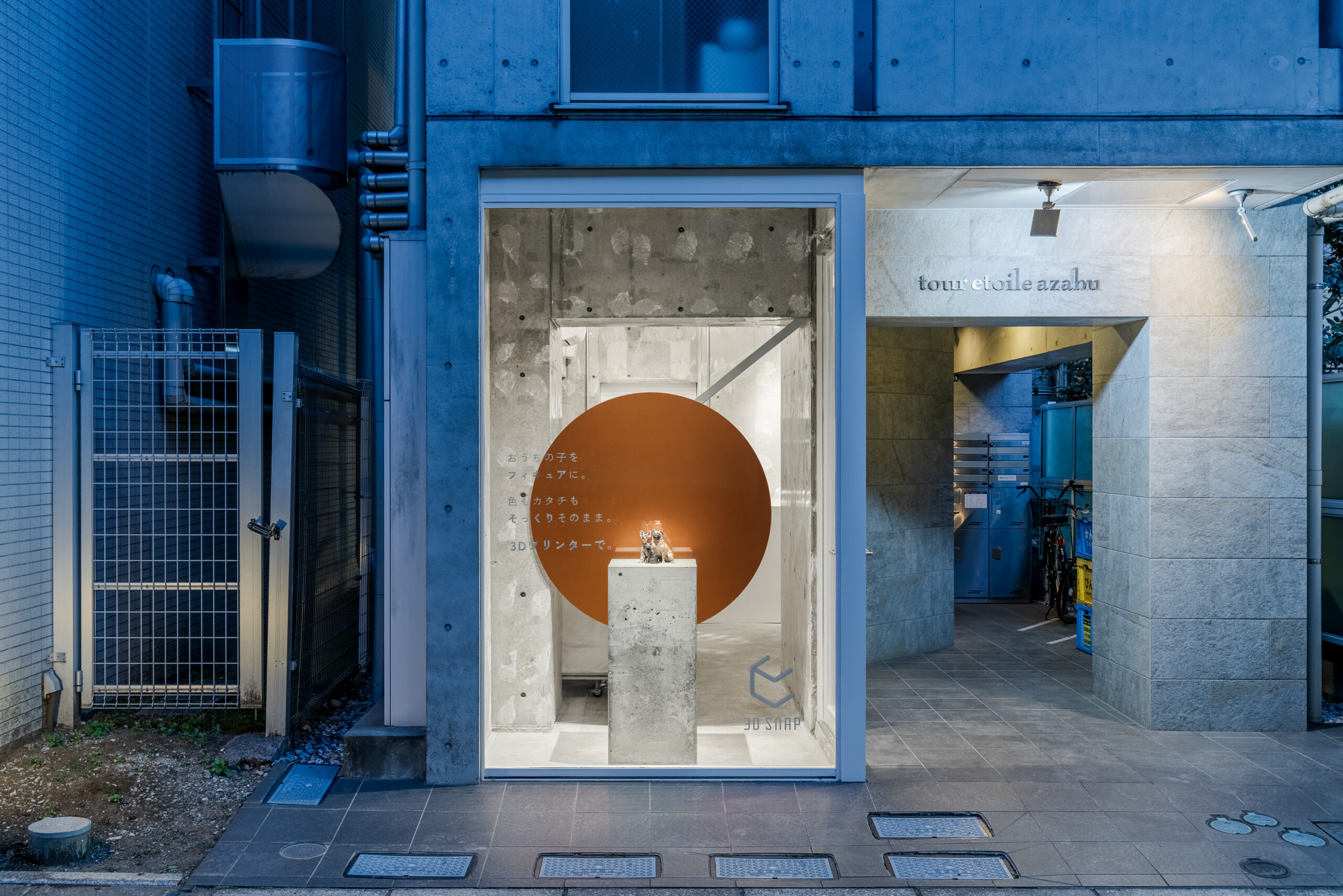
「3D SNAP」は愛犬を特殊な3Dカメラでスキャンし、3Dプリンターで世界にひとつだけのオリジナルフィギュアを作成できるショップである。
計画地は港区東麻布に位置し、5坪というコンパクトなスペースでプランをすることとなった。
空間のコアとなるファサードディスプレイの計画では、「たった一つの思い出」を一つの“点”と捉え、
その丸いオブジェクトがディスプレイ台の背景となるようなシーンを作っている。
また、計画地から程近い位置にある東京タワーを象徴するトラス構造のアイデアを一部トレースし、補強材のデザインを生み出している。
中央のスキャンブースの向かいに配置したカウンターなどは、エッジを流曲線とし柔らかな印象を持たせつつも、
真っ白素材を選定し、存在を曖昧にコントロールした。
コンパクトながらも地域との関係性を具現化し、お店としての目的を明快に表現した空間となった。
-
"3D SNAP" is a shop where you can scan your beloved dog with a special 3D camera and create a one-of-a-kind figurine of your dog using a 3D printer.
Our planned store is in Higashi-Azabu, Minato Ward, and it will be in a compact space of 16.5 square meters.
For the facade display, which serves as the core element of the space, we are producing a round object that will serve as the backdrop for the display stand. The round object symbolizes the single "point" of one's "unique memory."
Additionally, drawing inspiration from the nearby Tokyo Tower, a neighborhood landmark, we incorporated elements of its truss structure into the design of our reinforcement materials.
Elements such as the counter opposite the central scanning booth are crafted with flowing curves to evoke a gentle impression and built from pure white material to make their presence more subtle.
Despite its compact size, the space embodies the shop's relationship with the local area and clearly communicates its purpose. -

BIZOUX COREDO NIHONBASHIビズー コレド日本橋
- Category : Retail store / 物販店
- Location : Japan / 日本
- Area : 48.12㎡ / 48.12平米
- Constructor : Interior / 内装設計
-

AETHER GINZA エーテル 銀座
- Category : Retail store / 物販店
- Location : Japan / 日本
- Area : 18.18㎡ / 18.18平米
- Constructor : Interior / 内装設計
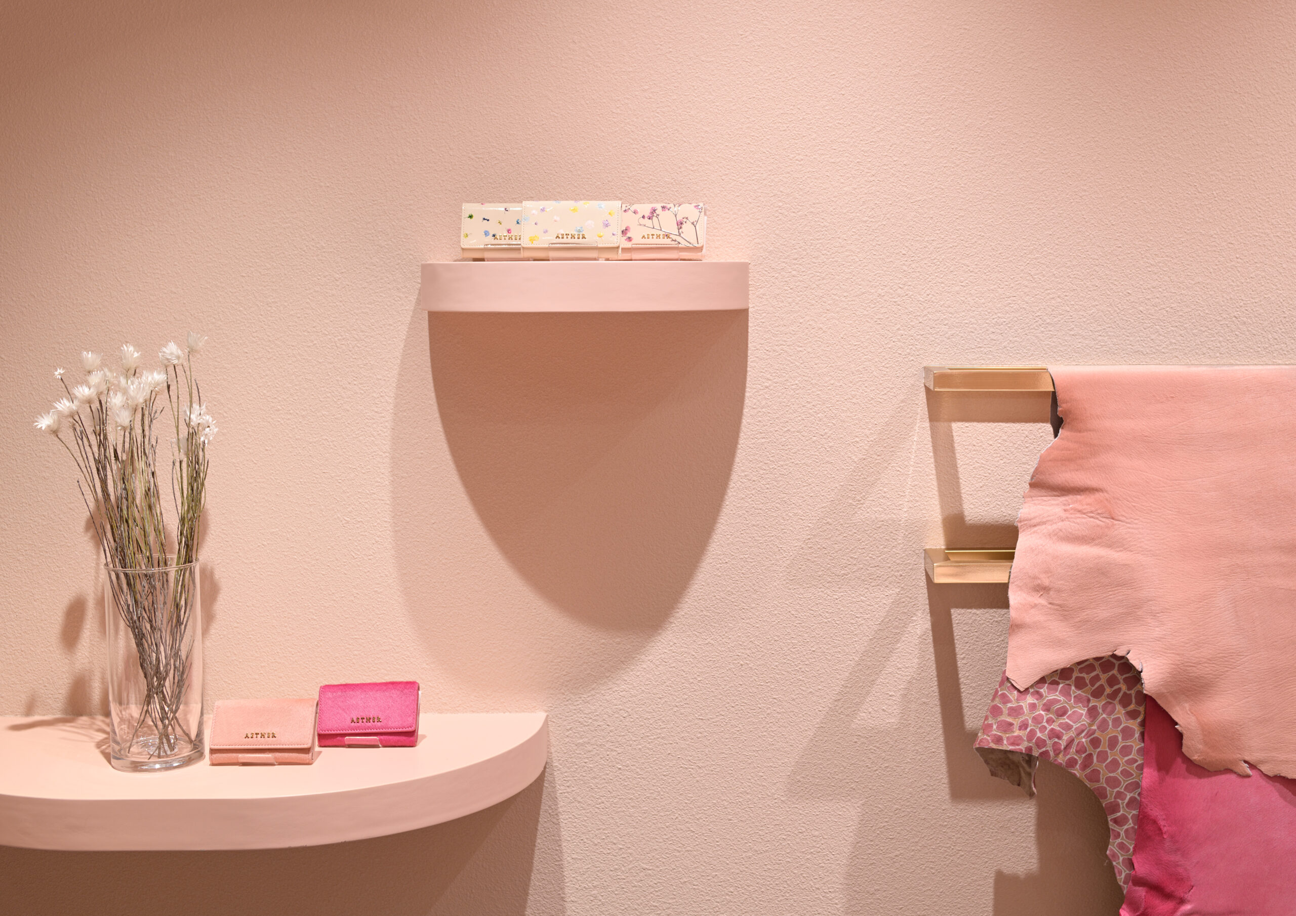
上質な本革を使用したレディース財布などを展開するレザーブランド「エーテル」のインテリアデザイン。
ロケーションは、高級商業地として海外ハイブランドの旗艦店などが集中する、銀座の一角。
“わたしに、咲く” というブランドコンセプトが大きな顔になっており、アイテムにもキュートな花柄や女性らしいカラーリングや質感が明解に表現されていることから、空間プランにおいてもブランドの考え方にかなり近い位置での繋がりを持たせることが重要だと考えた。
今回我々は、従来の異なる質感を組み合わせて空間を作っていく手法ではなく、一目みて女性らしさを感じ取れるよう、
空間に花が広がりピンク色に染まりゆくシーンを想像しながら 、“色”からつくり出される空間作りを意識した。
サーモンピンクの壁面には花びらのディテールを用い、R曲線によってコンパクトな店内にもやさしい動線を流し込んでいる。
銀座の街並みに現れたピンクのコントラストが、歩行者振り向かせる風景がまた面白い。
-
Interior design for the growing leather brand Aether, known for its ladies' purses made from high quality real leather.
The store is located on one street corner in Ginza, a luxury retail area famous for its concentration of flagship stores of high class foreign brands.
We decided to use the brand's own concept "In myself, bloom" as our main inspiration. Cute floral patterns and feminine coloring and textures are clearly expressed in the goods, so we thought it was important to have an open plan in which customers could get close to the brand and make a connection to its way of thinking.
This time, instead of employing the conventional method of combining different textures in order to create a space, we wanted to create a feeling of femininity that you could take in in one glance. So, while imagining a scene full of flowers and suffused with pink, we were conscious of creating a space created from "color".
The salmon pink walls have flower petal detailing, while the r–curves make for gentle flow lines despite the compact store interior.
It is also fascinating to see the pink contrast that has appeared in the Ginza streetscape attracting the attention of pedestrians. -
AETHER SHINSAIBASHIエーテル 心斎橋
- Category : Retail store / 物販店
- Location : Japan / 日本
- Area : 33.65㎡ / 33.65平米
- Constructor : Interior / 内装設計
-
BIZOUX NAGOYAビズー 名古屋
- Category : Retail store / 物販店
- Location : Japan / 日本
- Area : 43.01㎡ / 43.01平米
- Constructor : Interior / 内装設計
-
BIZOUX OSAKAビズー 大阪
- Category : Retail store / 物販店
- Location : Japan / 日本
- Area : -
- Constructor : Interior / 内装設計
-
KURA CHIKA by POTER TACHIKAWAクラチカ バイ ポーター 立川
- Category : Retail store / 物販店
- Location : Japan / 日本
- Area : 111.77㎡ / 111.77平米
- Constructor : Interior / 内装設計
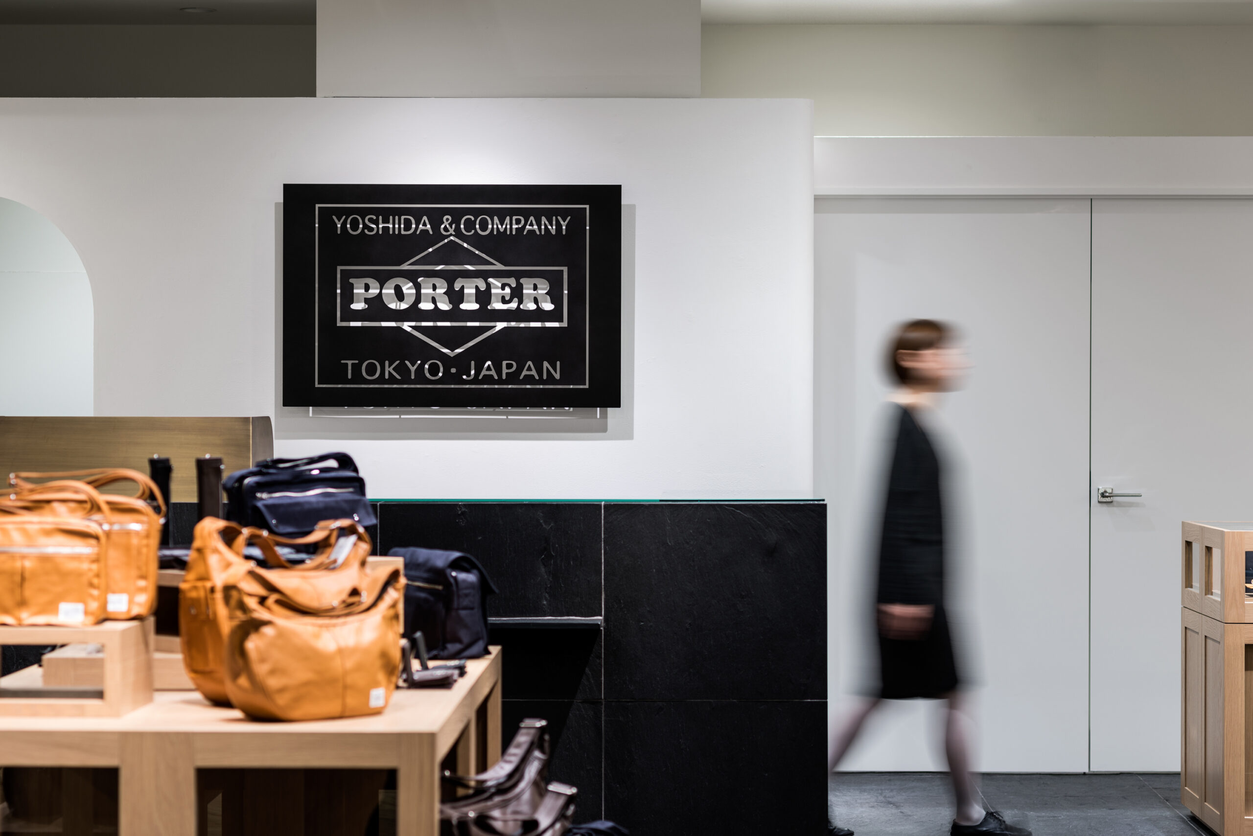
「吉田カバン」のオンリーショップ「クラチカ」のショップデザイン。
西東京エリアにおける玄関口となるJR立川駅に隣接するグランデュオ立川の、1.2F全体改装にともないリニューアルオープン。
郊外型ショッピングモールとして、ファミリー層を中心に利用が見込まれることから、家族の集う「LIVING」のショップコンセプトが土台として掲げられた。
我々は“CABINET”のキーワードを空間にインテリア装置として取入れ、機能を兼ね備えたオブジェクトとして点在させることで、日常の思い出を、リビングにアーカイブしていく感覚を引出す。
また、メイドインジャパンにこだわり続け、80年を迎えた意志を強化するために、
漆喰や玄昌石など、和の素材を積極的に取入れている。
–
This is the shop design of KURA CHIKA that is the only retail shop directly run by YOSHIDA KABAN.
Tachikawa KURA CHIKA is on the 2nd floor of GRANDUO next to JR Tachikawa Station.
Now the KURA CHIKA is grand re-opening with the renovation of Granduo.
As GRANDUO is a suburban-type shopping mall, many families are expected to visit our shop
Therefore, we created the shop design based on the concept of family gathering “LIVING.”
We aimed to let customers feel like archiving everyday memories on “LIVING”; a keyword “CABINET” was taken into space as interior device and dotted as the object equipped with functions.
Furthermore, we have been particular about “Made in Japan,” so we have proactively incorporated Japanese materials such as “shikkui”(plasters) and “genshoseki”(type of slate) in order to emphasize the willingness as the company in business for 80 years. -

STANDARD BOOK STORE NU Chayamachiスタンダードブックストア ヌー茶屋町
- Category : Restaurant / 飲食店
- Location : Japan / 日本
- Area : 297㎡ / 297平米
- Constructor : Interior / 内装設計