-
KAZAN MENZO火山麺蔵
- Category : Restaurant / 飲食店
- Location : China / 中国
- Area : 101.96㎡ / 101.96平米
- Constructor : Interior / 内装設計
うどん店「火山麺蔵」のインテリアデザイン。
中華人民共和国広東省の中央南部に位置する佛山市のショッピングモール内の一角。
香港のクライアントは、日本在住経験があることから、ニッポンのうどん文化を中国に持ち込みたいと、ゼロからの開発を試みていた。
我々は同じく日本のグラフィックデザイナーと協働し、ブランディングから空間構築までトータルでディレクション。
プランニングでは、うどん職人の技から日本の独自の食文化が生まれていることから、空間を造る素材も日本の職人の技法を用いたものとし、「食」と「居」の生まれるプロセスが大きく繋がっている必要性を感じた。
空間の大部分を占める床と壁は左官工法で統一し、少し高すぎる印象があった天井には、切妻屋根状の錆鉄格子組を居心地の良い高さに吊り、仮想天井にみたてることにした。また、天井ブラックアウトをして天地でのコントラストを感じ取るようにしている。
ファサードには、現地のひとが一目みて異文化を感じ取り、日本の食文化に興味をもってもらえるように大きな暖簾でエントランスエリアを造っている。
私自身も大好きなうどん。中国での更なる展開を願っている。
-
This is the interior design of the udon restaurant "Kazan Menzo," which is located in a corner of a shopping mall in Foshan City in the south-central part of Guangdong Province, China.
Our Hong Kong client, who had lived in Japan in the past, wanted to bring Japan's udon culture to China and have this project built from scratch.
We worked closely with a Japanese graphic designer and oversaw the entire project from its branding to its spatial construction.
In the course of our planning, we decided to harness materials that showcase the techniques of Japanese craftsmen when building this space as Japan's unique food culture was born from the skills of udon artisans. We also felt that it was essential to create a powerful connection between the processes of food preparation and space-building.
Plaster was applied to the floors and walls, which occupy the majority of the restaurant's surface area. The ceiling, which appeared to be a little too high, was transformed into a false ceiling by suspending a rusted iron lattice with a gable-roof design at a comfortable height. The ceiling was also blacked out to create a sharper contrast between the top and bottom areas of the restaurant.
For the façade of the restaurant, we created an entrance area fitted with a large noren that will immediately draw the locals' attention to the differences in culture and pique their interest in Japan's food culture.
I personally love udon, and I hope we can see more udon restaurants in China. -
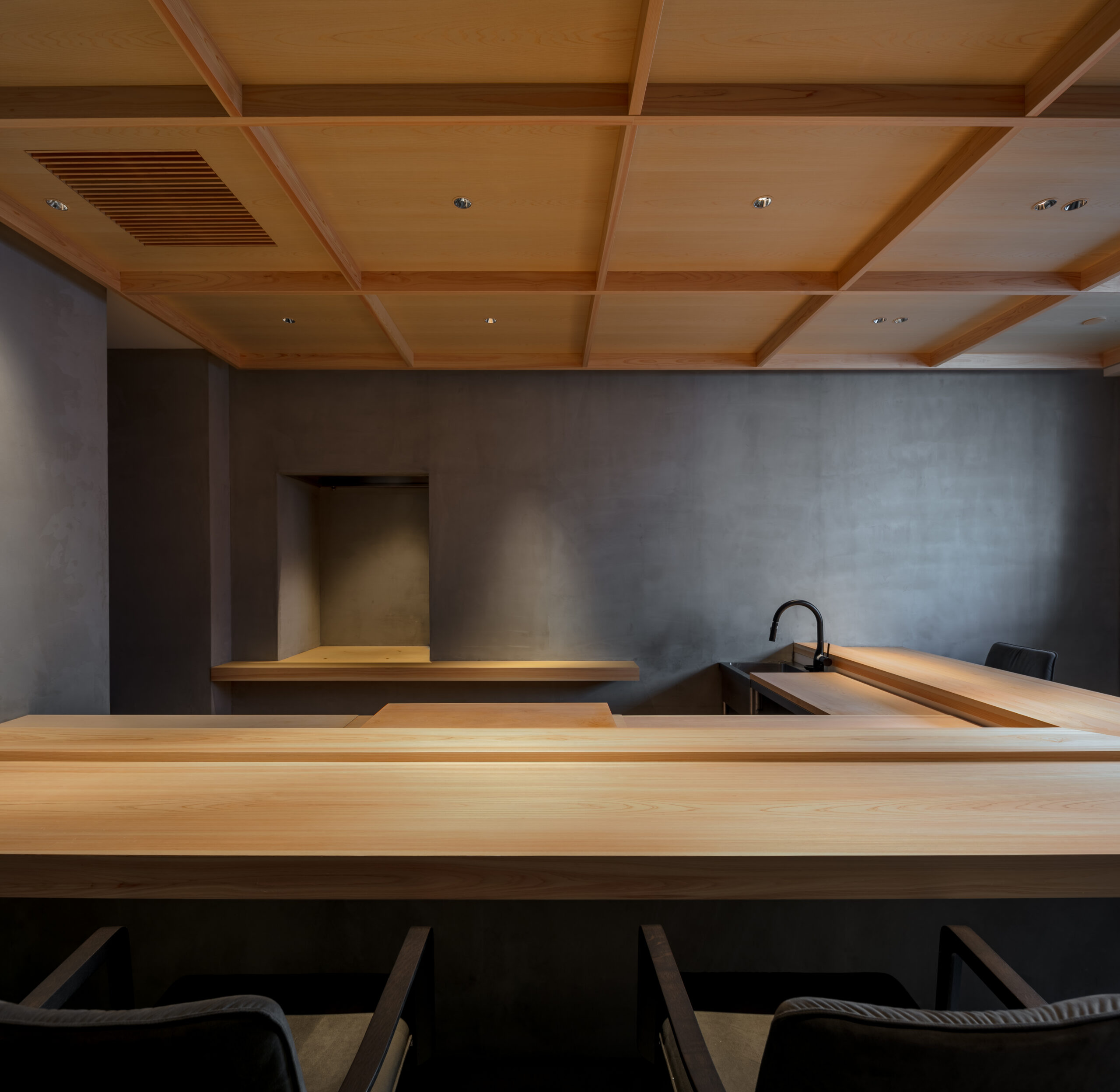
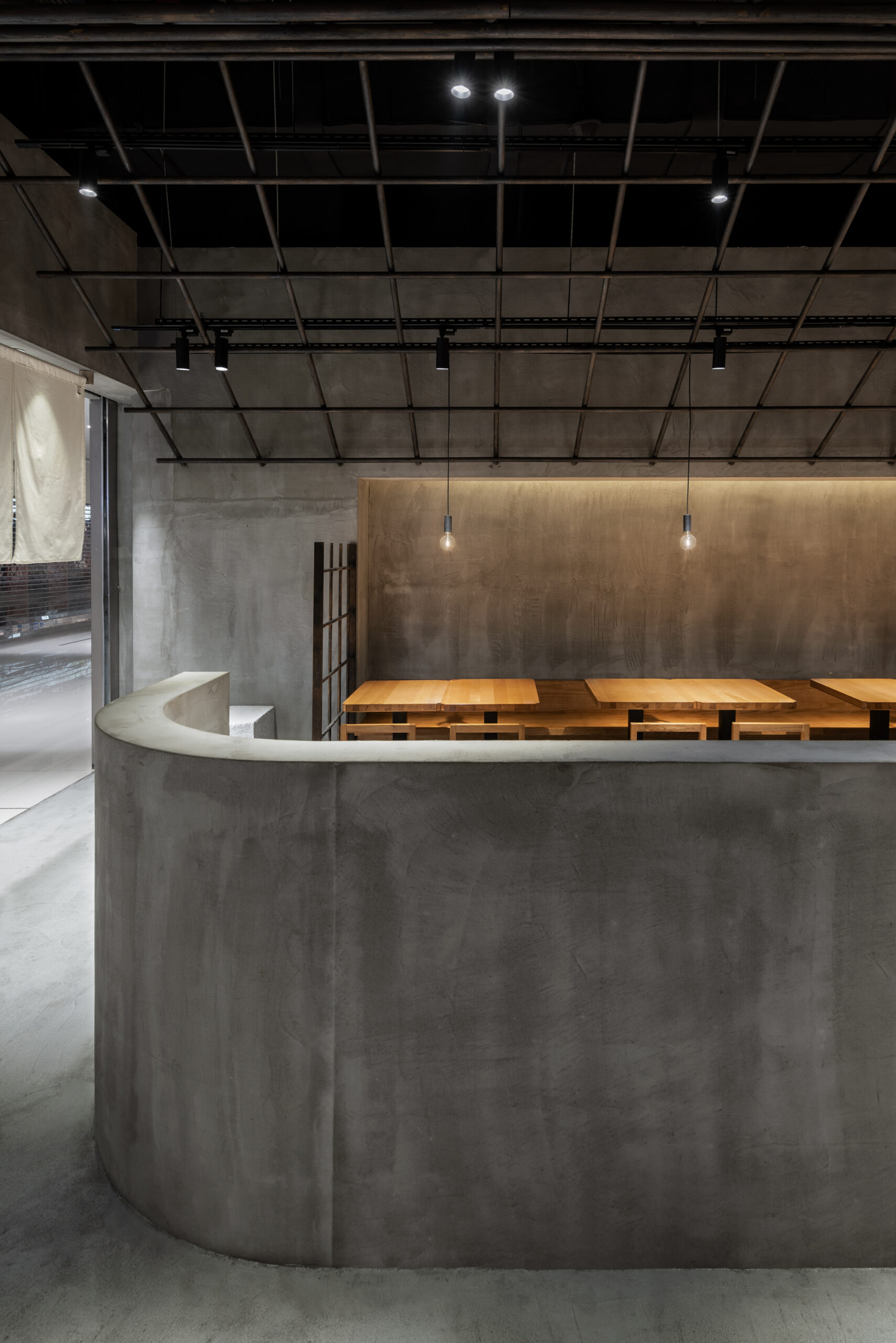
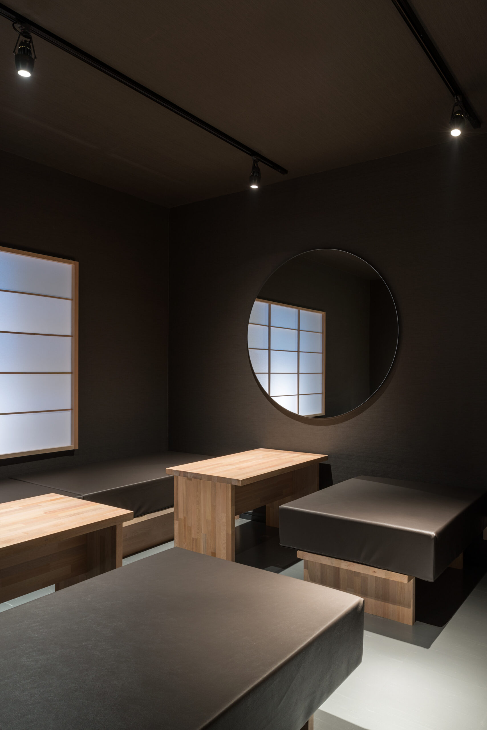
SUSHI SENSUI鮨 泉水
- Category : Restaurant / 飲食店
- Location : Japan / 日本
- Area : 72.6㎡ / 72.6平米
- Constructor : Interior / 内装設計
-
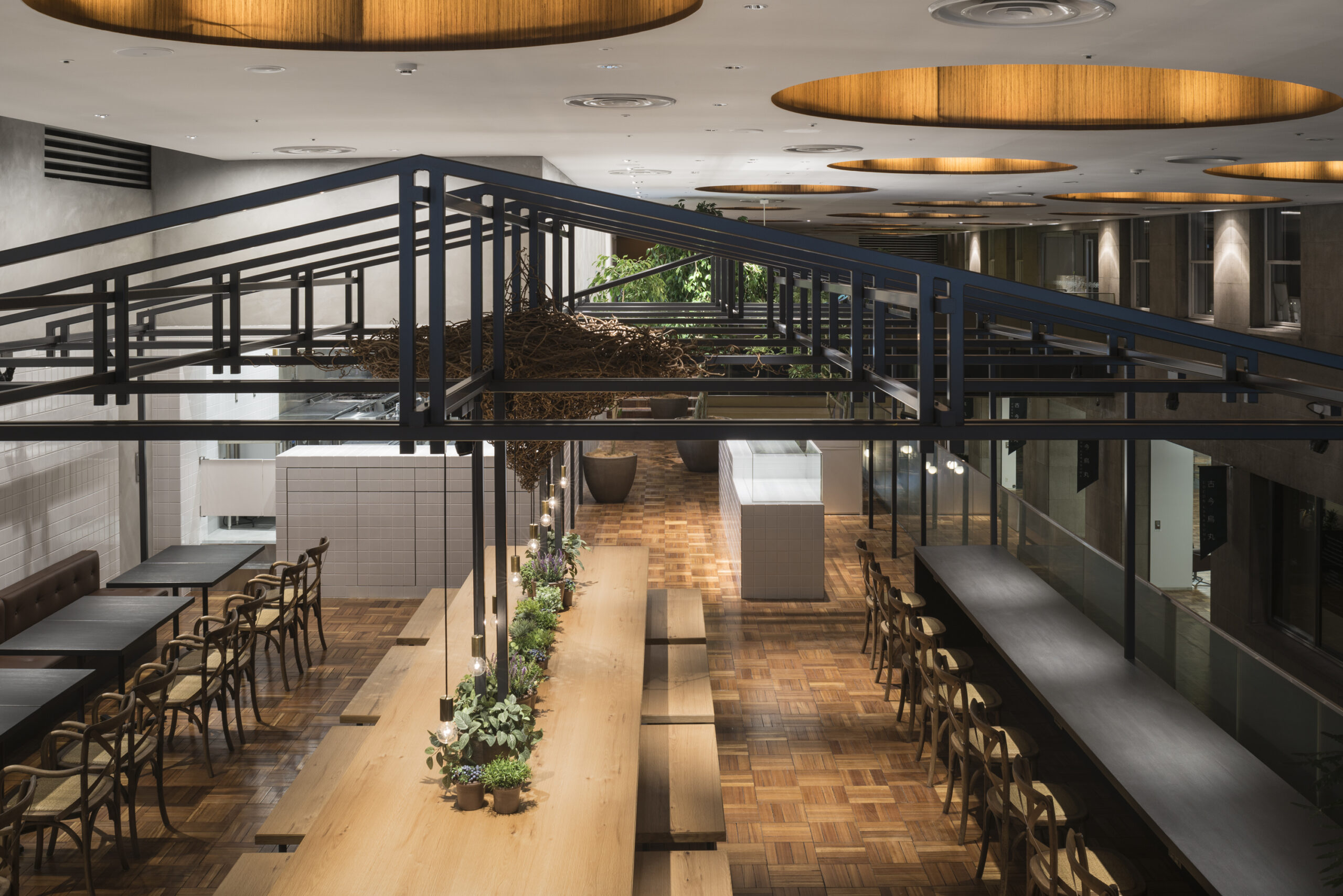
HARVEST DAYSハーベストデイズ
- Category : Restaurant / 飲食店
- Location : Japan / 日本
- Area : 237.78㎡ / 237.78平米
- Constructor : Interior / 内装設計
-

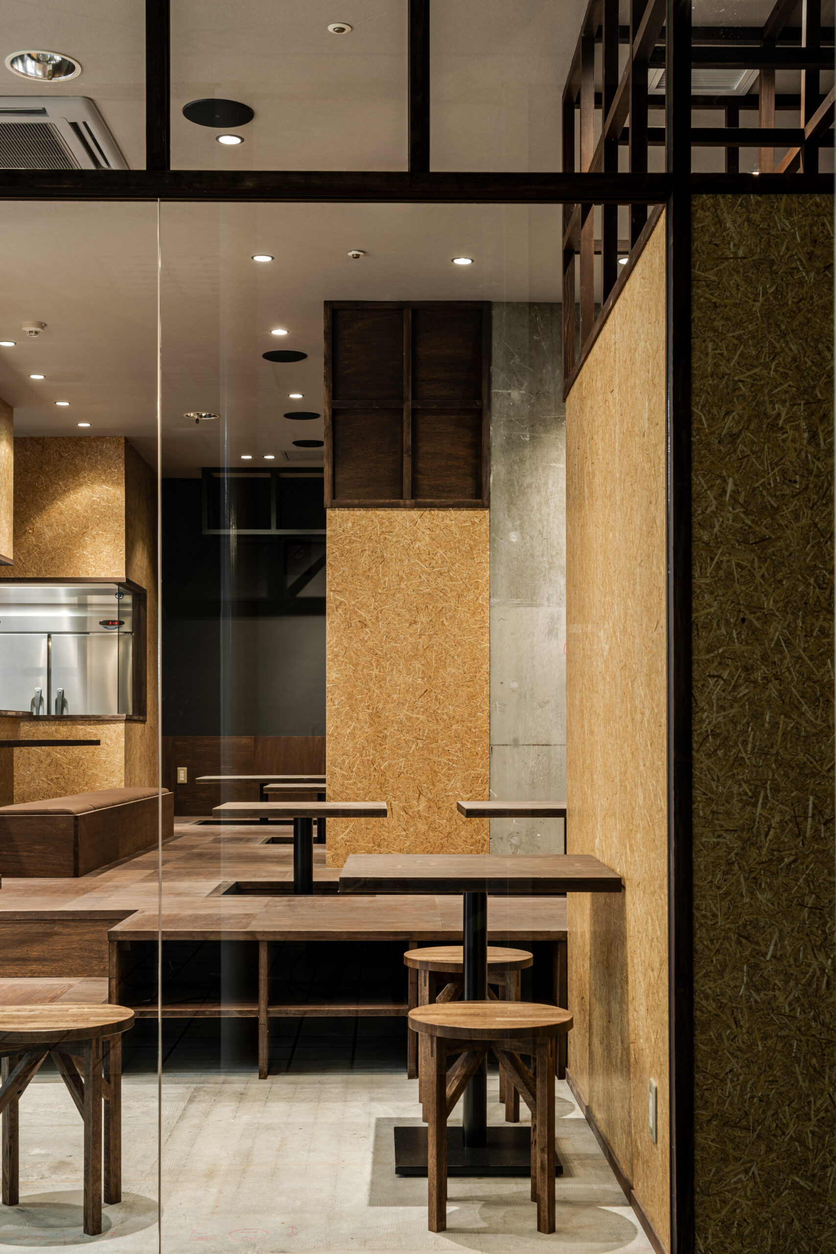
TOKISUSHI TENJINBASHIときすし 天神橋
- Category : Restaurant / 飲食店
- Location : Japan / 日本
- Area : 89.02㎡ / 89.02平米
- Constructor : Interior / 内装設計
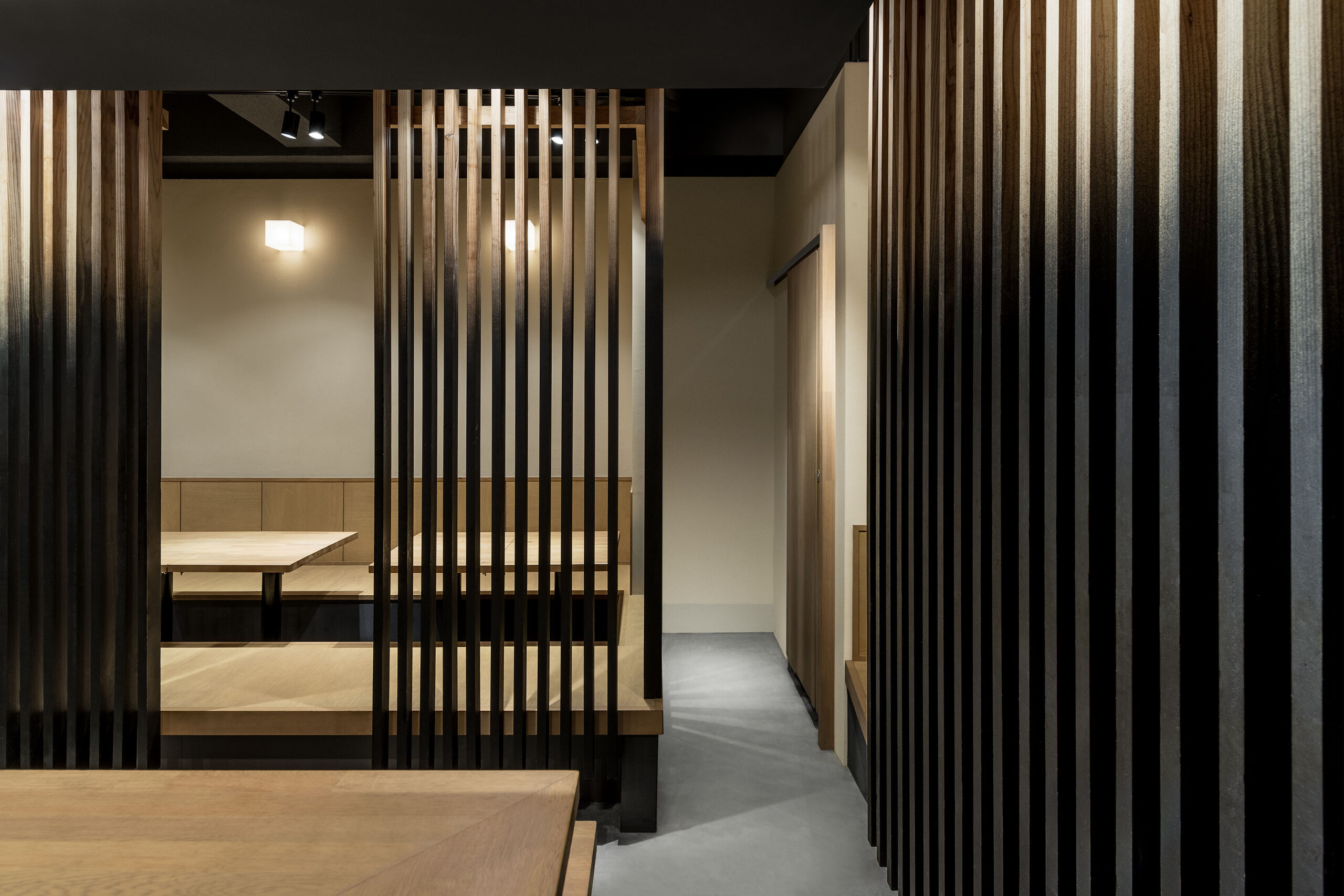
「ときすし」は大阪の裏なんばを本店として展開するカジュアルな寿司屋。露骨なスケルトンに塗られた錆止めの赤いペイントが目に入る。
単なる機能とでしか認識できないものが、色自体に変化を加えずでも、”寿司” という用途を取得することで、錆止めの赤から、和の赤へともう一つの顔へと変化を遂げる。
つまり ”意識のデザイン” ということになる。先入観と固定概念をうまく利用し、意識のみをコントロールすることで、既存機能に形無いしつらえが担保された。ここにくるお客様が、どんな意識を抱くのかが楽しみである。
-
Tokisushi is a casual sushi restaurant that originated from its flagship store in Ura-Namba, Osaka. The Red rust-proofing paint on the exposed skeleton catches people’s eyes.
Even without changing the color itself, which is recognized as a function of just rust-proofing, red transforms Japanese red by acquiring the purpose of “Sushi".
In other words, “Consciousness Designing”.
By skillfully guiding perception through preconceptions and stereotypes, an intangible composition was realized within the existing functions. We look forward to seeing what kind of consciousness visitors will harbor here. -

Entr’acteアントラクト
- Category : Restaurant / 飲食店
- Location : Japan / 日本
- Area : 99.8㎡ / 99.8平米
- Constructor : Interior / 内装設計
日常の中で、大抵のことを知識として知ることが可能だが、自分の行動範囲から外れる物事を“経験する”ということは極めて限られる。
グラスに注がれたワインは、ワイナリーによって製造されていく風景を頭の中で知識として蓄積しているものの、経験出来るのはテーブルの上で起こることだけである。つまり、概念としては親しく細部まで理解できても、自分の触覚、味覚、臭覚、聴覚を通していない情報は、経験として蓄積されない。
視界に広がるマテリアル(BRASS)は、ゆるやかに腐食酸化が進むようなクリアコーティングを施し、ゆっくりと時間をかけて成長(変化)していくようなものにした。また、ワインの本質である、完成ではなく成熟に向かう表情を意識しながらも、知識だけでは得ることのできない、経験できる空間を目指すことが重要だと考えた。“完成しない=結論がでない”ということが、一つの楽しみでもある。
-
It is possible to acquire most knowledge in daily life, but it is extremely limited that experience things outside comfort zone.
The wine poured into a glass holds the memory of the landscapes from which it was born, landscapes known only in the mind, while the true experience takes place solely on the table. It means the information doesn’t accumulate as an experience, which isn’t through your Touch, Taste, Smell, and Hearing, even if you understood the concept in detail briefly.
BRASS — a material that unfolds across the gaze, that grows (changes) while taking the time by applying a clear coating to allow a gradual progression of corrosion and oxidation.
While being conscious of the expression of wine’s essence — not completion but maturation — we considered it important to create a space where experiences unattainable through knowledge alone can be realized.
The idea of “not being complete = having no conclusion” is, in itself, one of the pleasures. -
Inaho Syokudou Lty932イナホ食堂 エルティ草津
- Category : Restaurant / 飲食店
- Location : Japan / 日本
- Area : 63.88㎡ / 63.88平米
- Constructor : Interior / 内装設計
-
TOKISUSHI HANAREときすし はなれ
- Category : Restaurant / 飲食店
- Location : Japan / 日本
- Area : 72.7㎡ / 72.7平米
- Constructor : Interior / 内装設計
-
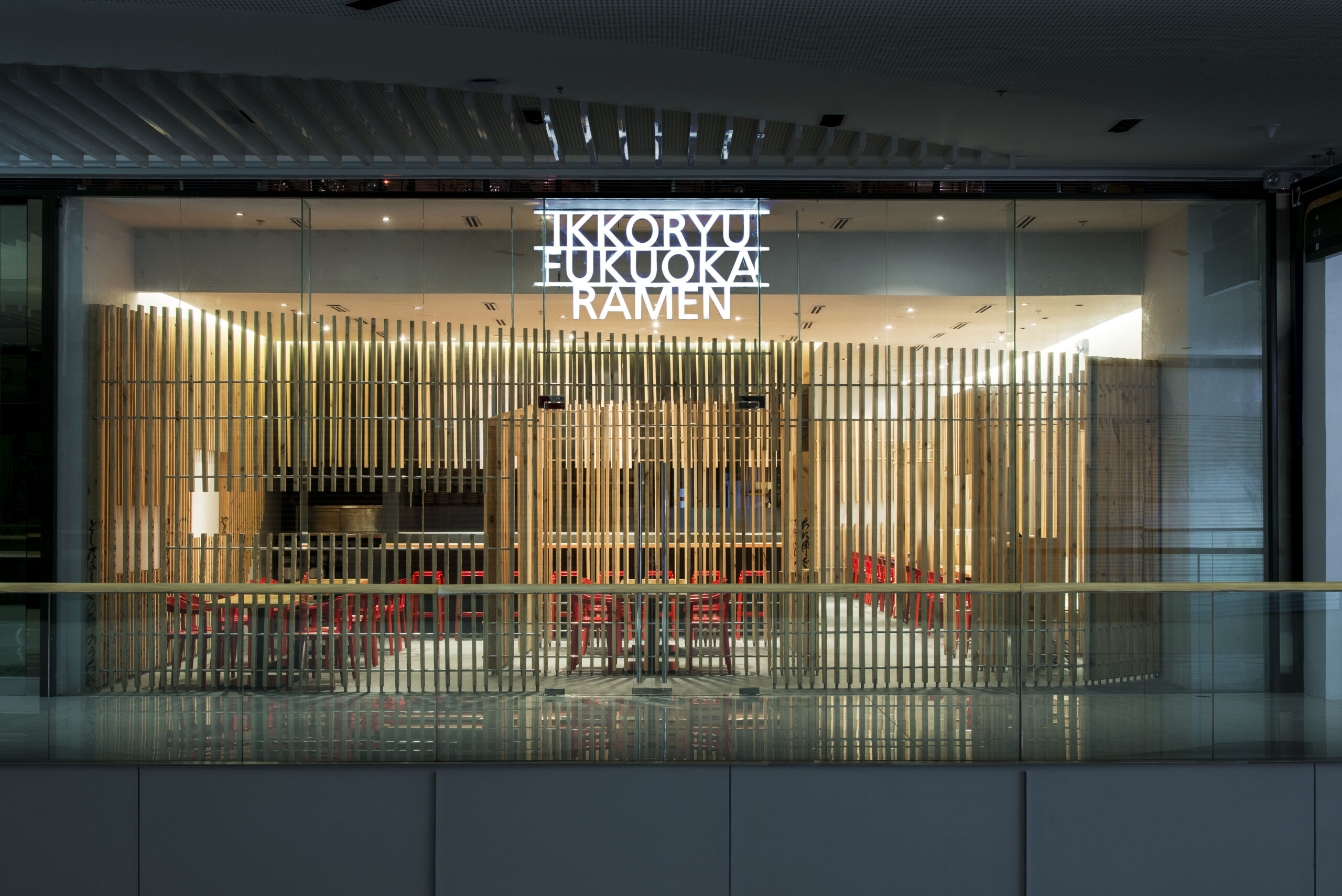
IKKORYU FUKUOKA RAMEN SM Aura一康流ラーメン 福岡 エスエムオーラ
- Category : Restaurant / 飲食店
- Location : Philippines / フィリピン
- Area : 201㎡ / 201平米
- Constructor : Interior / 内装設計
-
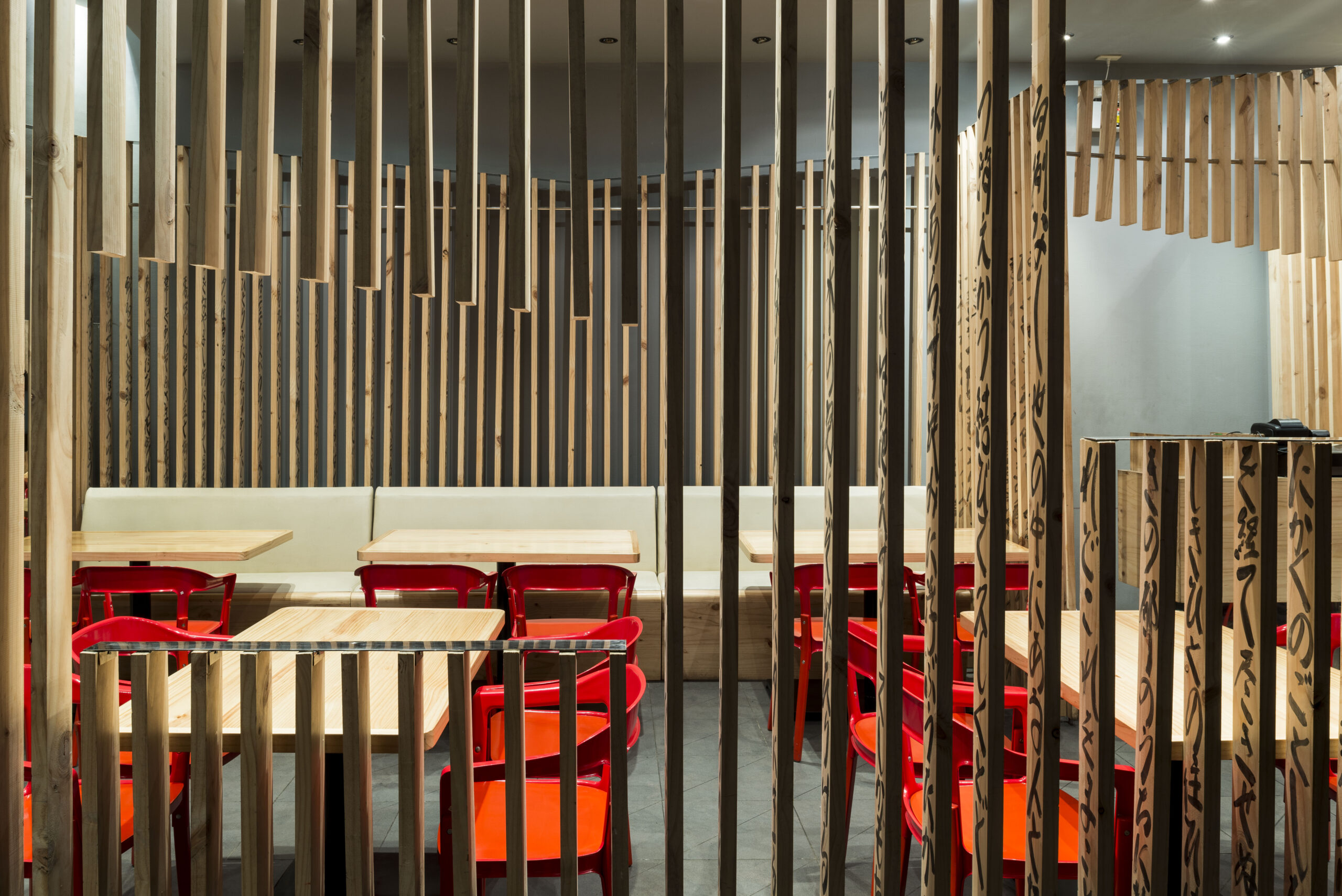
IKKORYU FUKUOKA RAMEN Shangri-la Plaza一康流ラーメン 福岡 シャングリラプラザ
- Category : Restaurant / 飲食店
- Location : Philippines / フィリピン
- Area : 136㎡ / 136平米
- Constructor : Interior / 内装設計
-
Yasai to Gohan Nobukichi野菜とごはん ノブキチ
- Category : Restaurant / 飲食店
- Location : Japan / 日本
- Area : 54.7㎡ / 54.7平米
- Constructor : Interior / 内装設計
滋賀県の市街中心部から少し離れた閑静な場所にあるカジュアルなフレンチレストラン。フレンチ料理は特等席に座りワインと共にコース料理などを、会話を楽しみながらゆっくり時間を過ごすもの。我々は、”歩いている時間”と”座っている時間”にコントラストをつける試みた。店内の壁面には、歩行の際の目線である高さに一つの境界線を設け、モルタルからプライウッドへ、ペンダントライトの高さ位置までをもコントロール。入り口をくぐり、テーブルにエスコートされた訪問者は、座った瞬間高さ100センチの風景に気づく。更にグループ客にも対応できる奥のスペースは、メーンフロアと同じ要素を反転する事で、店内の連続性を意識させると同時に、訪問者の高鳴る気持ちを増幅させる装置として機能。カジュアルさを伴った、その地域に愛されるレストランを目指した。
–
This design is for a casual French restaurant located in a quiet neighborhood at some distance from downtown Shiga.The pleasure of French dinner I think is to take your sweet time with conversation and wine at a special seat.Our new approach to this design is to show the contrast of sense between when you are walking and when you are seated.We created a border line at the eye level on the every wall in this restaurant.It doesn’t only run between the mortal finish and the plywood, but also controls the level of each pendant light.All the guests escorted from the entrance and seated must be surprised at the view of 100 centimeters high.The materials on each side of the border line are replaced each other on the walls of the room for a large group at the back of the restaurant.This visual shift works well to make guests aware of the continuity of design, and to inflate their expectations.This restaurant which moderately keeps casualness would be loved by the local population. -
Ukarekintokiうかれ金時
- Category : Restaurant / 飲食店
- Location : Japan / 日本
- Area : 39.2㎡ / 39.2平米
- Constructor : Interior / 内装設計
オープンキッチンとし、調理してる姿を披露するだけでは、「焼き鳥」の本当の魅力が伝わらないと感じたので、空間において「焼き鳥」特性や魅力をそのまま映し出す。外装、内装を構成する木製のルーバーを、全て仕上げず、一部グラデーション効果を与え、ゆるやかに素材の存在を明確にしていくことで、焼き鳥の「素材・たれ・焼き」を表現したオリジナルのインテリアとして機能。
-
We felt that simply having an open kitchen and showcasing the cooking process would not fully convey the true charm of yakitori. Therefore, we believed it was important for the space itself to reflect the unique characteristics and appeal of “Yakitori.”
The wooden Louver, which consists of exterior and interior, has an unfinished finish, and it's a partial gradation gently clarifying the existence of material.
Thus, it works as a function of original interior expressing Ingredients, signature glaze, and Precision grilling.
-

Inaho Syokudouイナホ食堂
- Category : Restaurant / 飲食店
- Location : Japan / 日本
- Area : 69.3㎡ / 69.3平米
- Constructor : Interior / 内装設計
オーナーのイメージする「女性が入れる赤ちょうちんの店」を表現するために、単一的な視界ではなく、店主が真ん中に立ち、視覚的に回遊できる空間をつくることで、よりコミュニケーションをとれるような、そんなお客さんとの関係・距離をデザインすることを考えた。お客さんが集まり、大衆感あふれるにぎやかな空間から「集積」という言葉をテーマとして、集う、会する、逢う、寄り合う、蓄積する、つちかう などといった役割をつくり、長く愛される、人と食事の関係が生まれる新しい食堂を目指すお店である。
-
For expressing an owner’s idea of “ An izakaya with red lanterns welcoming females”, rather than a singular viewpoint, the owner stands in the central and with a sense of visual flow. Through this approach, the space is designed to create a relationship and distance with customers that encourages natural communication.
People gather, and a warm and bustling atmosphere fills the space.
From this sense of accumulation — of meeting, connecting, and cultivating — the theme “Bunching” emerges. Loved longer and create a relationship with people and dinner, which we want to be an unprecedented style.
-
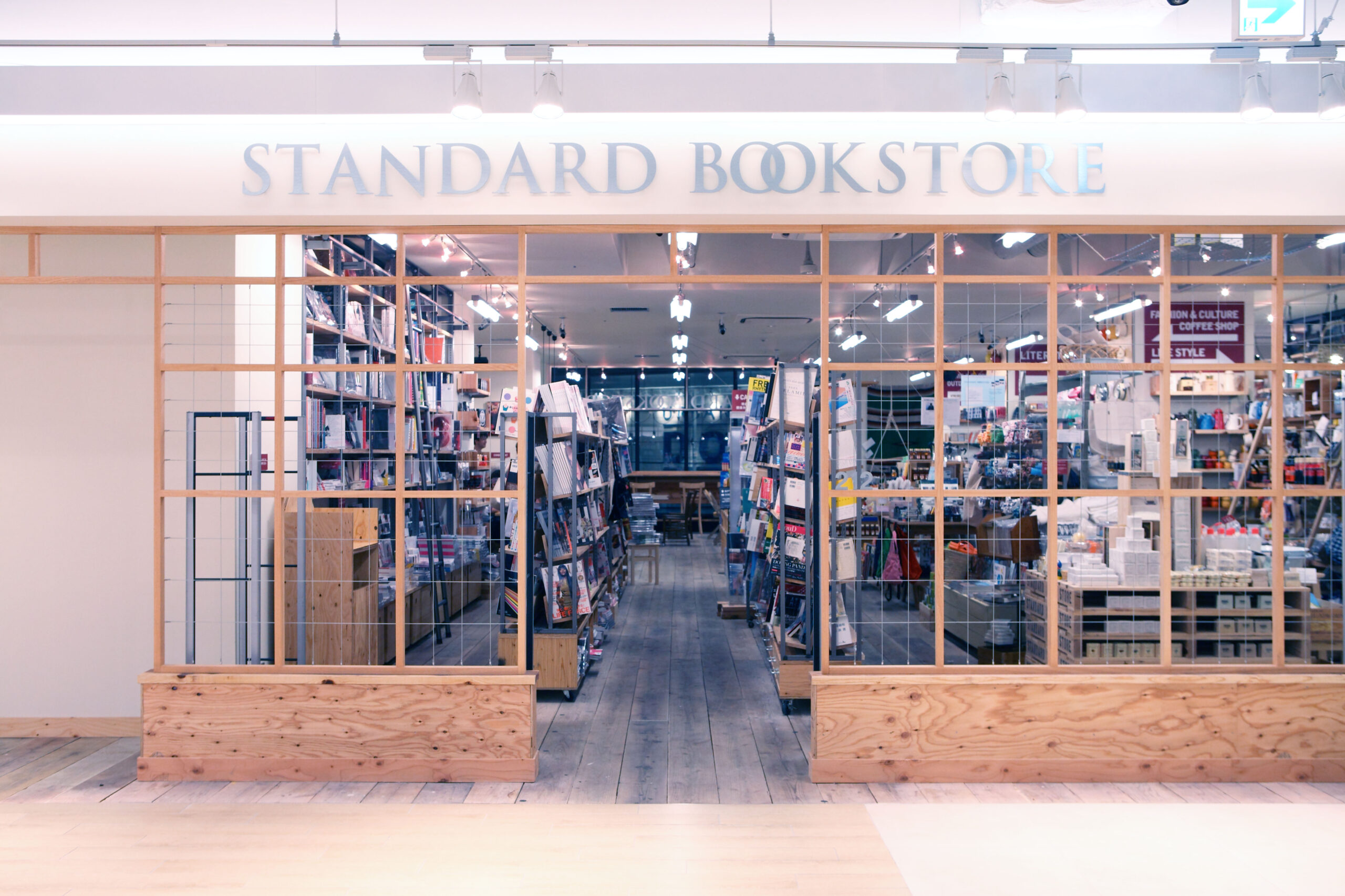
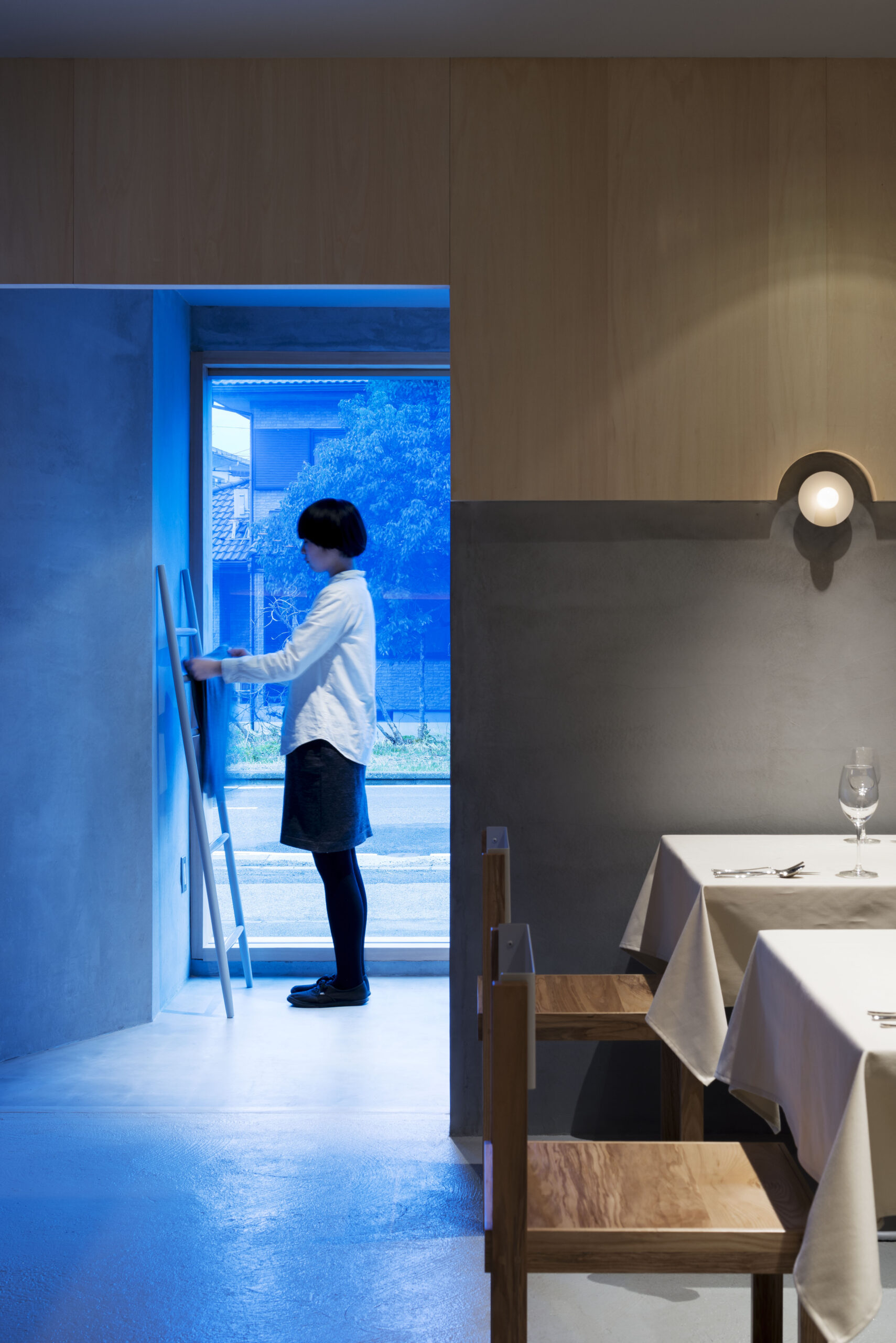
STANDARD BOOK STORE NU Chayamachiスタンダードブックストア ヌー茶屋町
- Category : Restaurant / 飲食店
- Location : Japan / 日本
- Area : 297㎡ / 297平米
- Constructor : Interior / 内装設計