
TOKISUSHI TENJINBASHIときすし 天神橋
Type of Project :
Interior / 内装設計
Category :
Restaurant / 飲食店
Location :
Japan / 日本
Area :
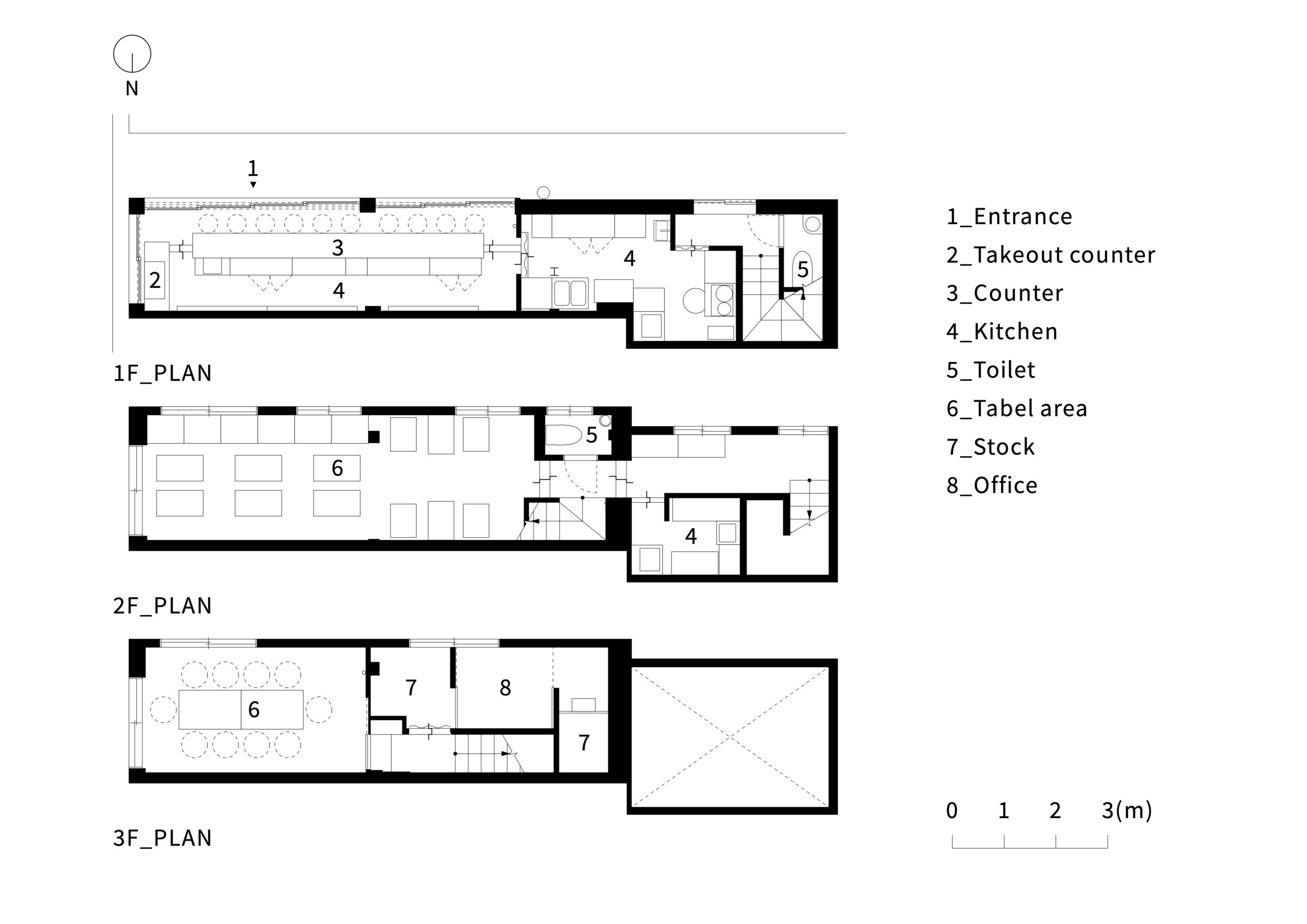
89.02㎡ / 89.02平米
Location:
Osaka, Japan / 大阪
Use:
Sushi / 寿司
Date:
Dec. 2016 / 2016年 12月
Client:
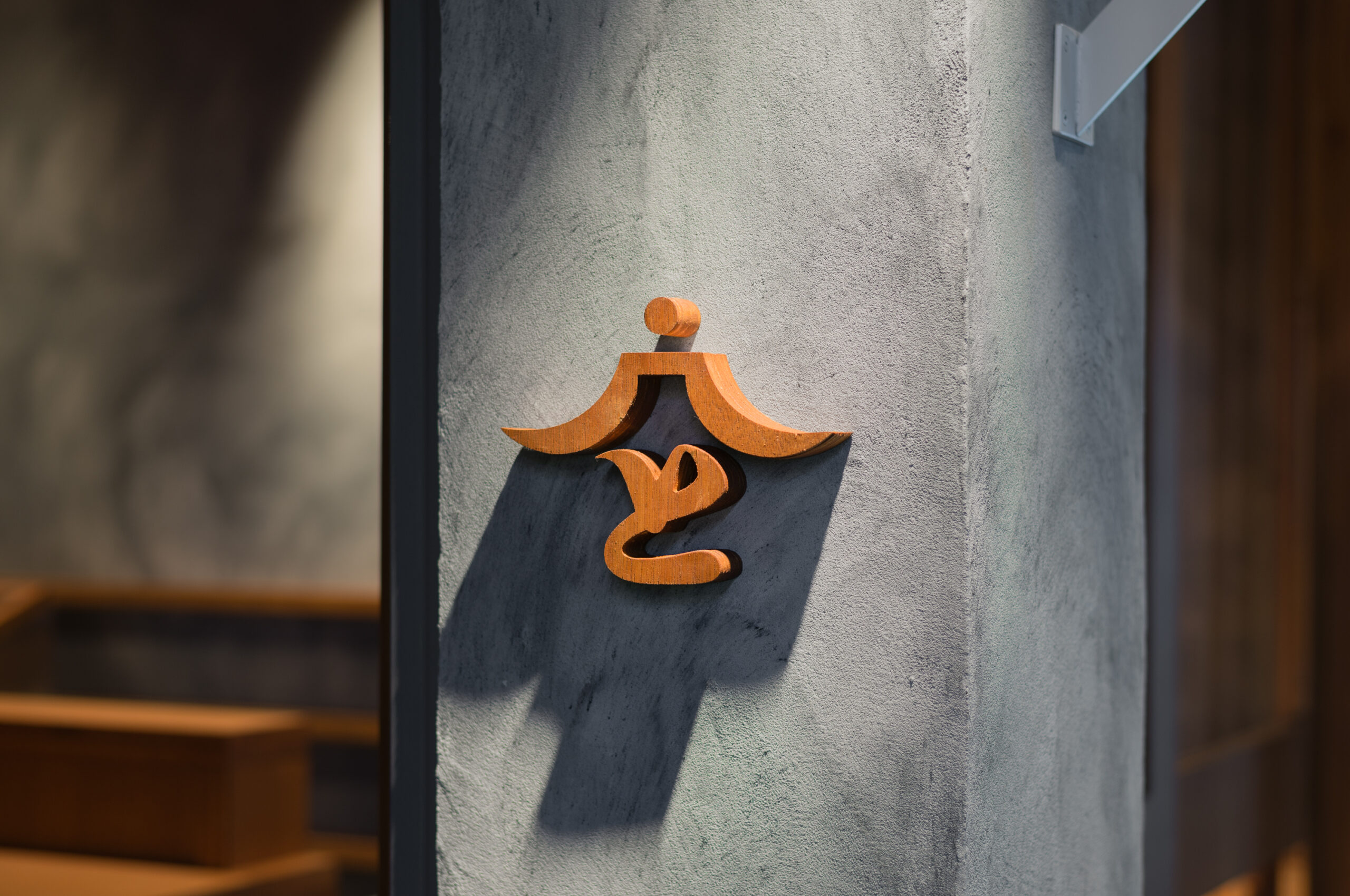
Saeki / 鮓え季(ときすし)
Design:
RID®︎ / アールアイディー
Lighting:
ModuleX / モデュレックス
Photographer:
Yoshiro Masuda / 増田 好郎
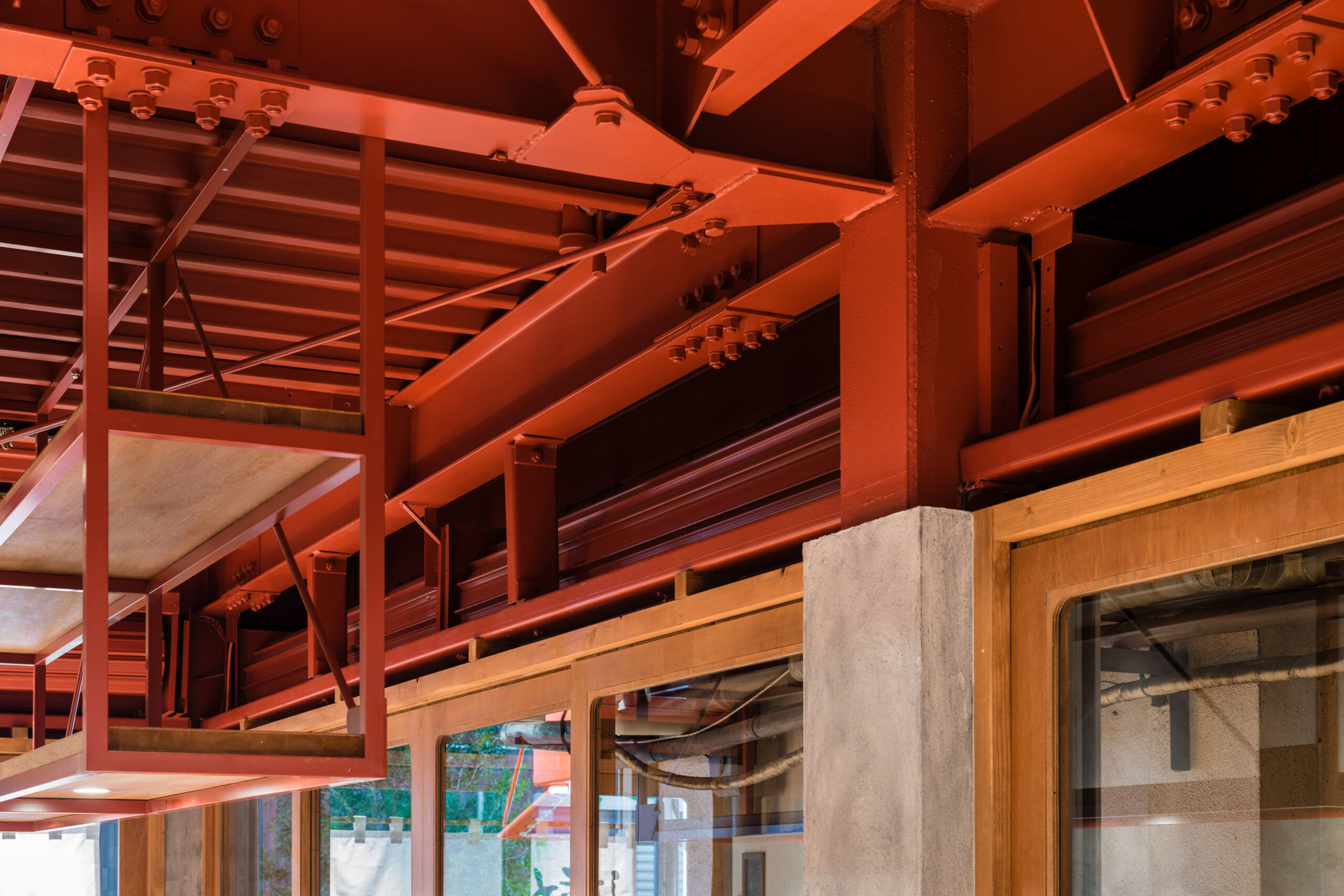
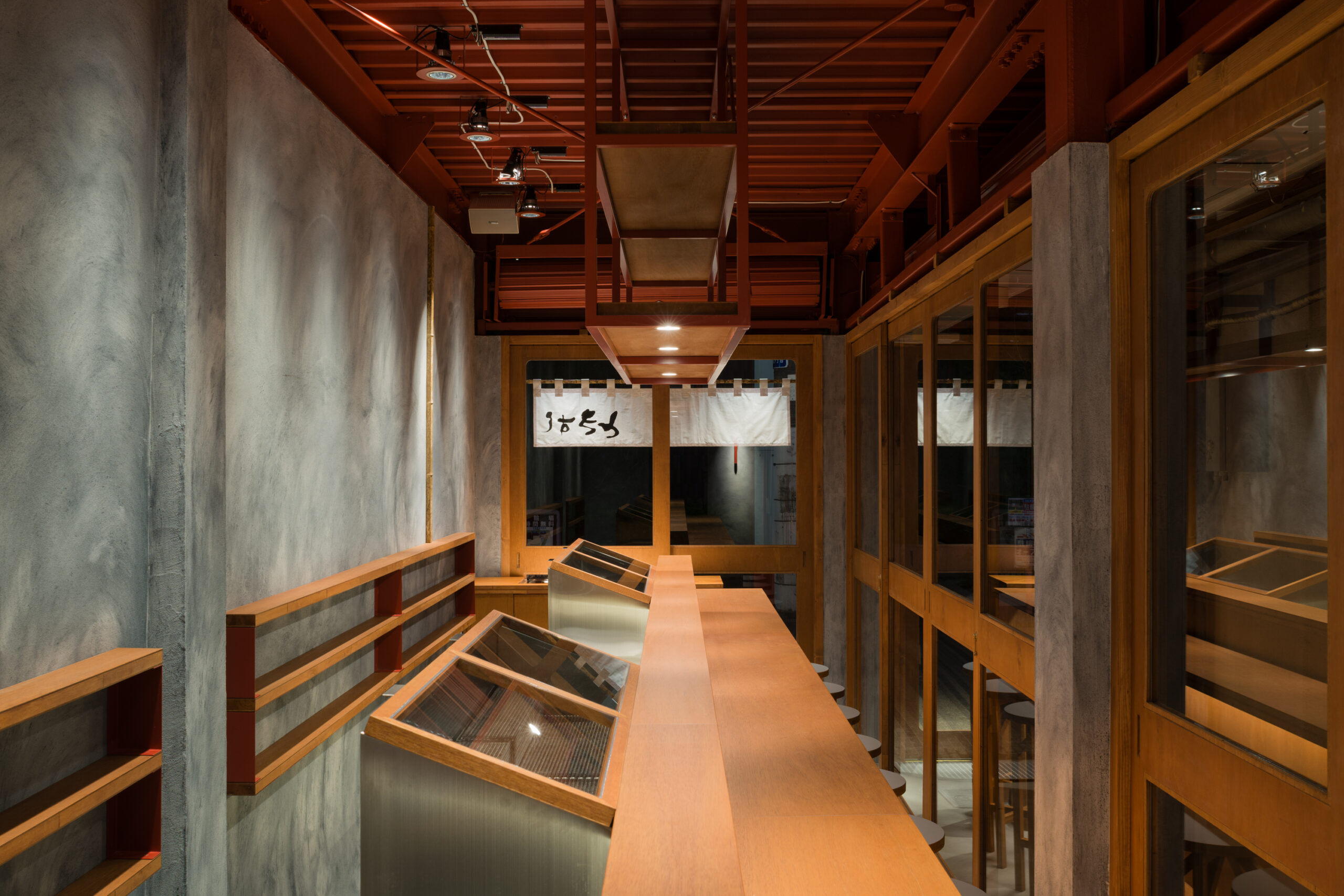
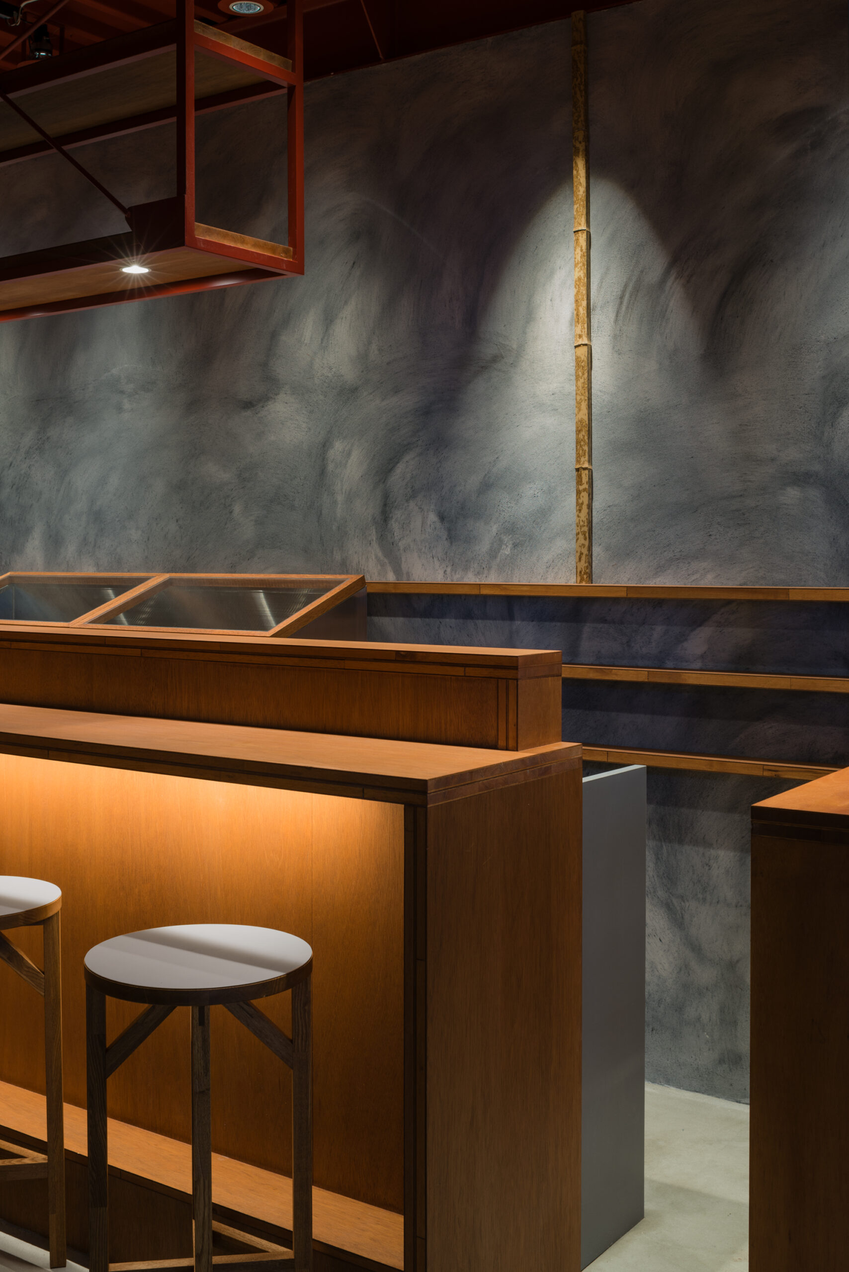
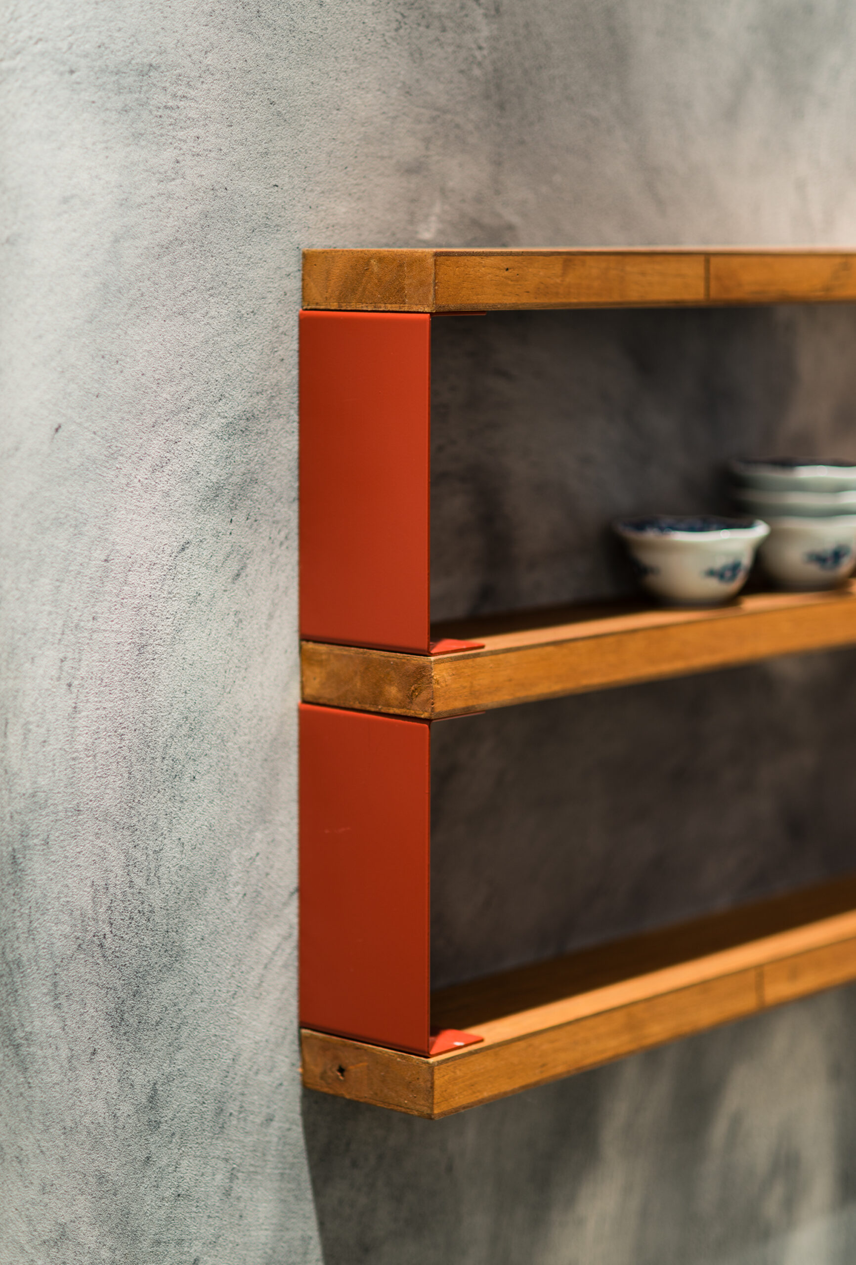
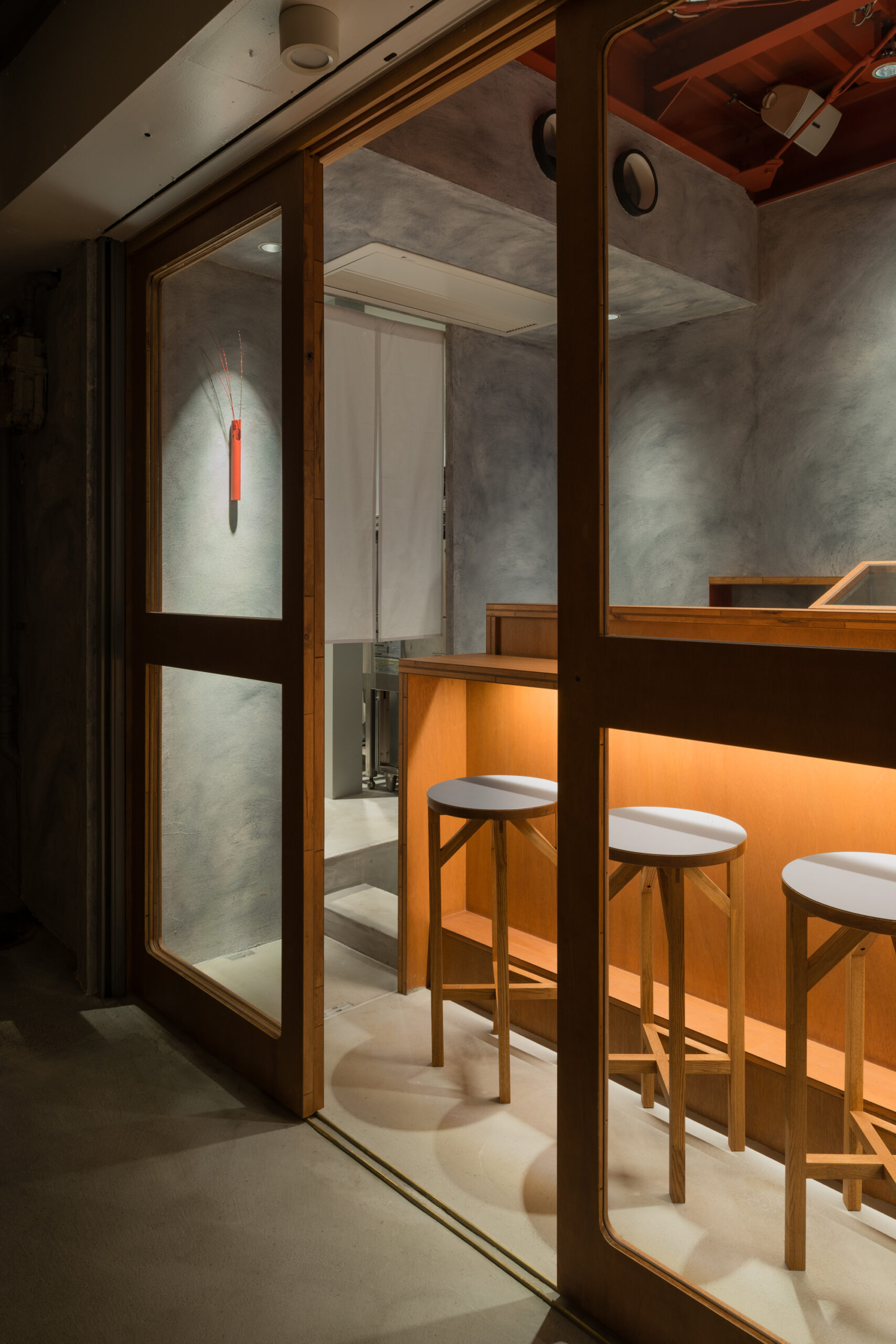
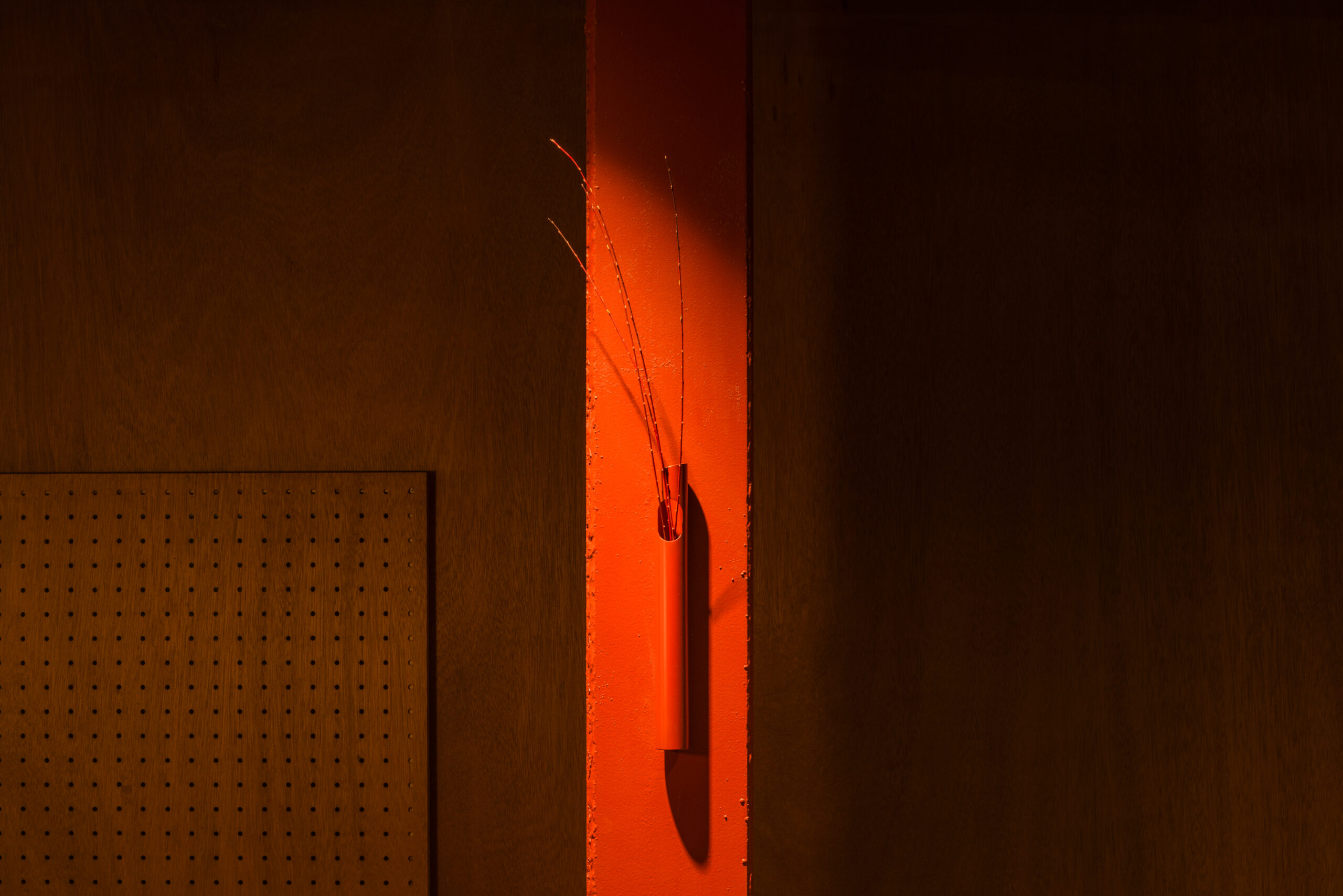
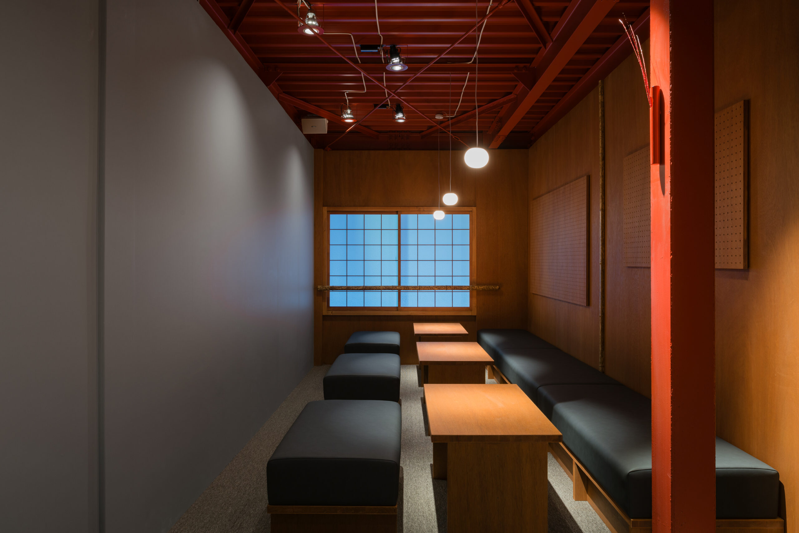
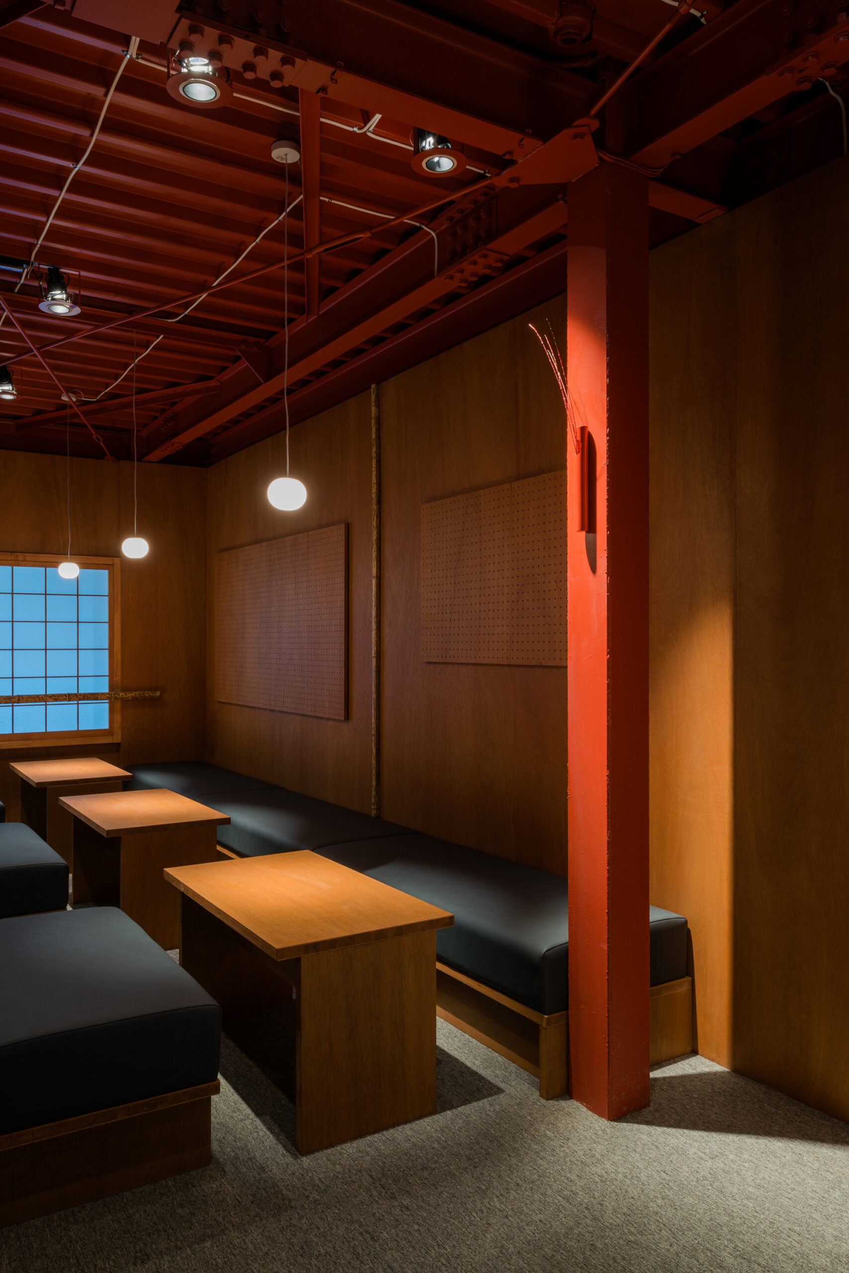
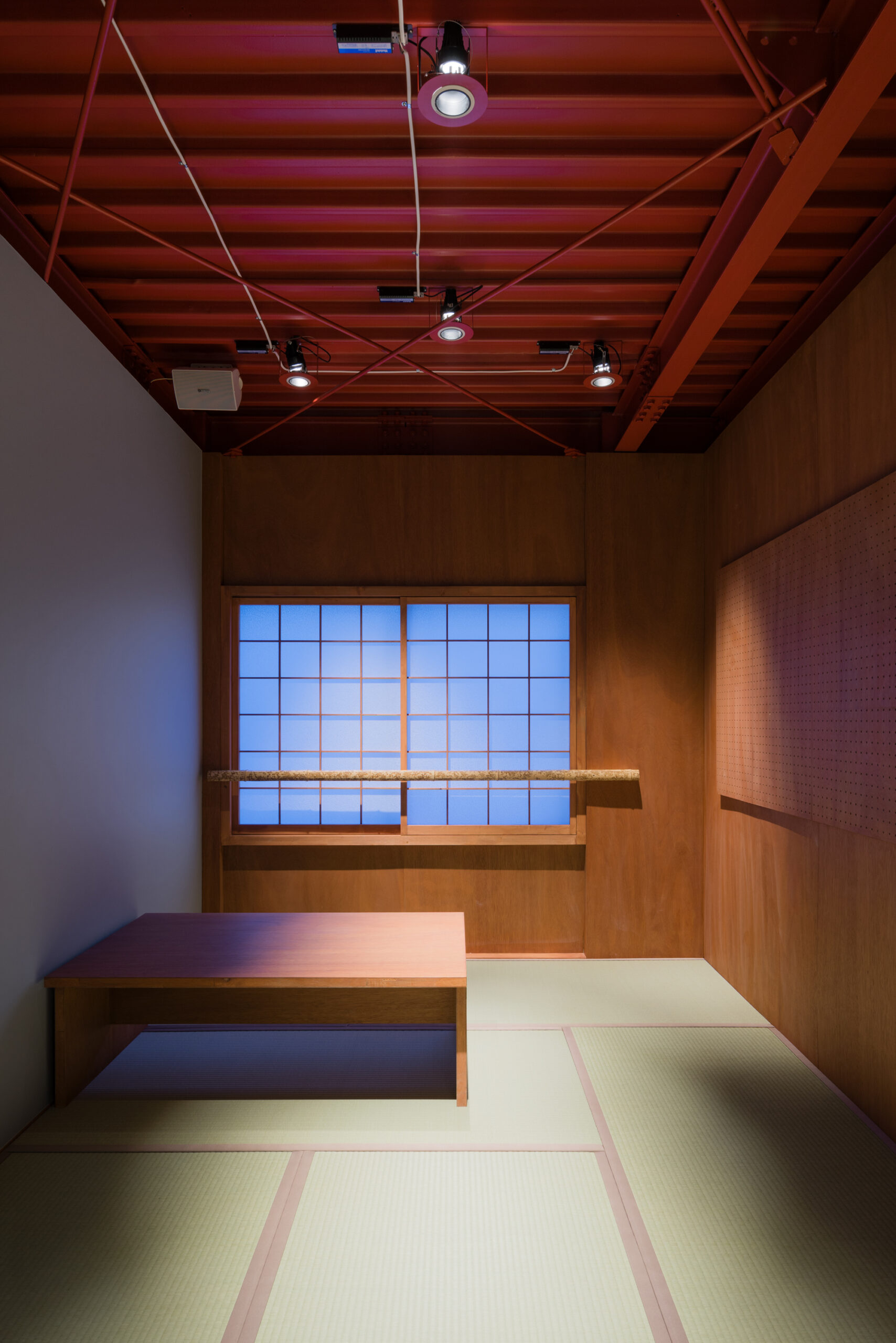
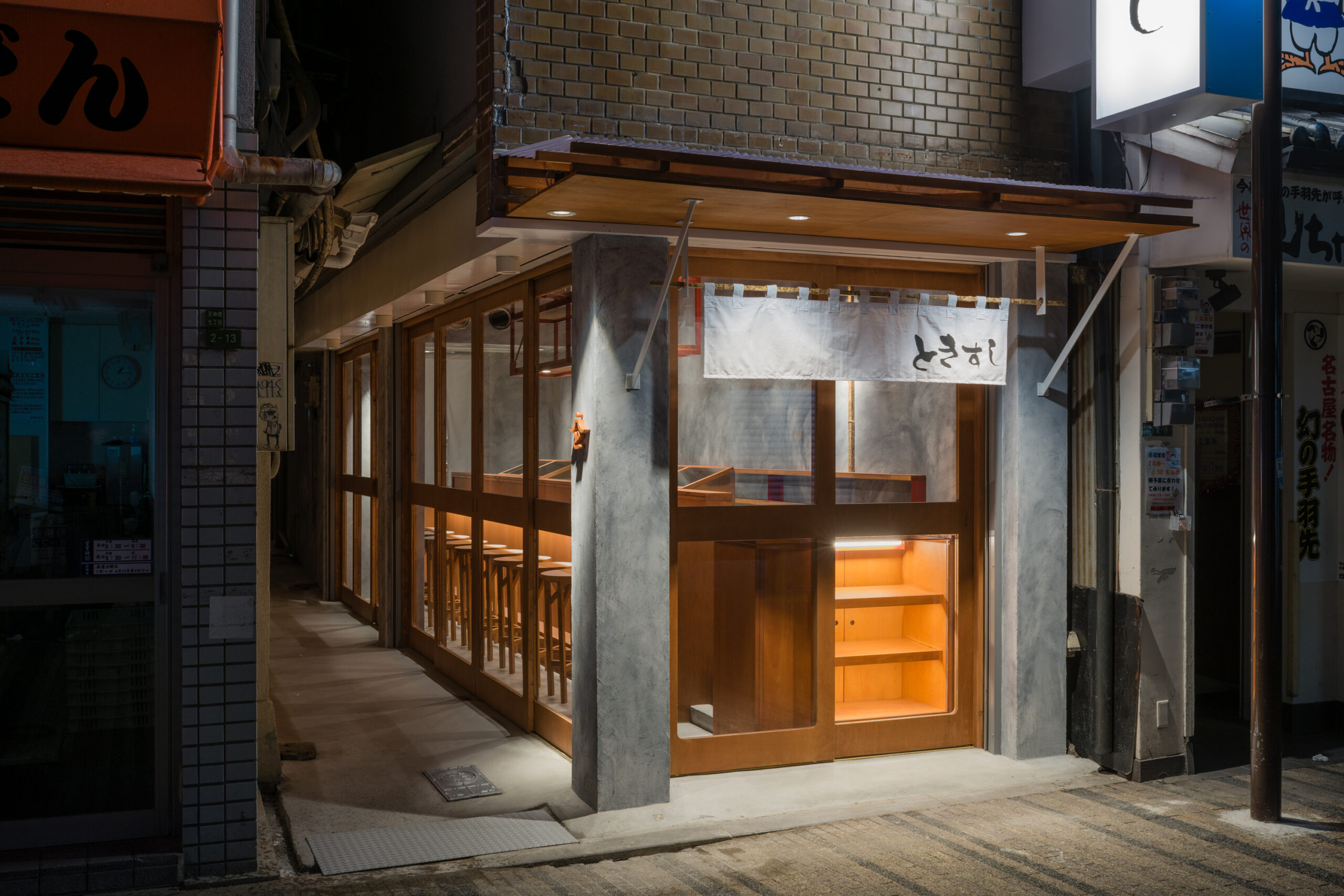
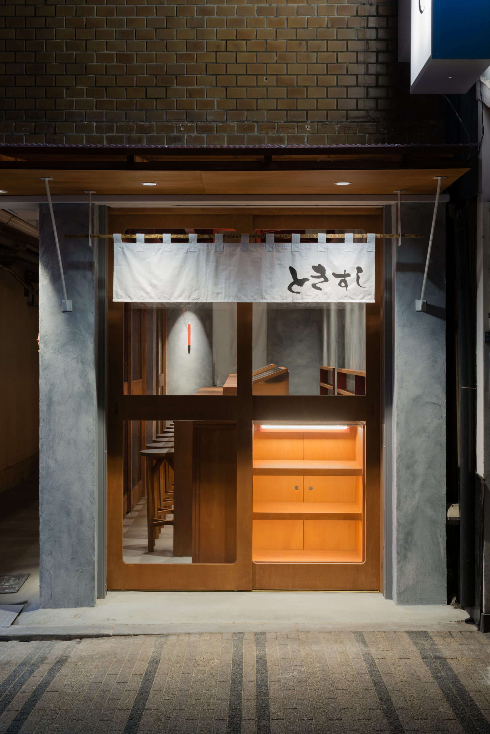
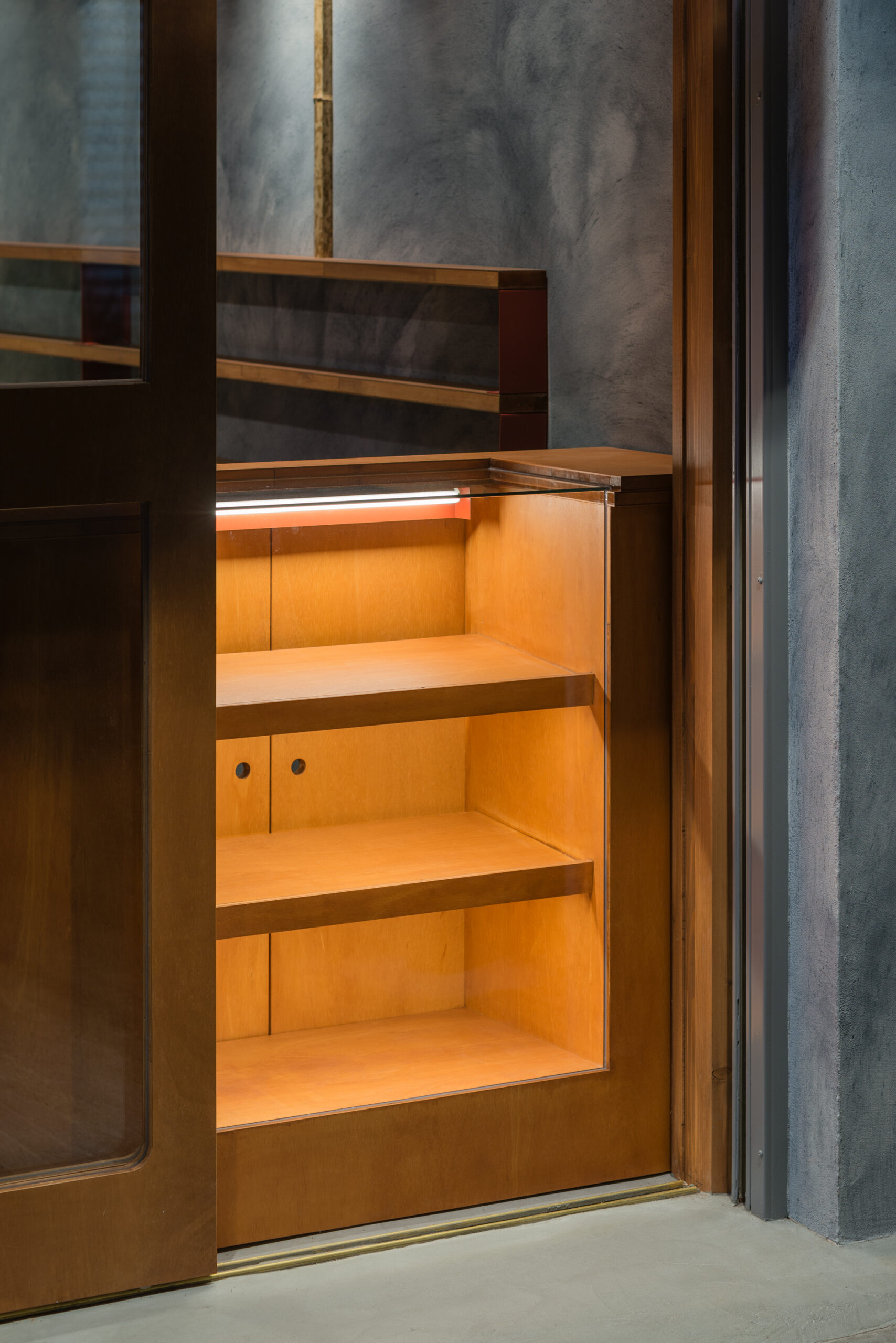
「ときすし」は大阪の裏なんばを本店として展開するカジュアルな寿司屋。露骨なスケルトンに塗られた錆止めの赤いペイントが目に入る。
単なる機能とでしか認識できないものが、色自体に変化を加えずでも、”寿司” という用途を取得することで、錆止めの赤から、和の赤へともう一つの顔へと変化を遂げる。
つまり ”意識のデザイン” ということになる。先入観と固定概念をうまく利用し、意識のみをコントロールすることで、既存機能に形無いしつらえが担保された。ここにくるお客様が、どんな意識を抱くのかが楽しみである。
-
Tokisushi is a casual sushi restaurant that originated from its flagship store in Ura-Namba, Osaka. The Red rust-proofing paint on the exposed skeleton catches people’s eyes.
Even without changing the color itself, which is recognized as a function of just rust-proofing, red transforms Japanese red by acquiring the purpose of “Sushi".
In other words, “Consciousness Designing”.
By skillfully guiding perception through preconceptions and stereotypes, an intangible composition was realized within the existing functions. We look forward to seeing what kind of consciousness visitors will harbor here.